Monday, 27 February 2017

Yorkshire Sculpture Park

YSP

I really wanted to come to the YSP in order to see Angela Hardings exhibition and I finally managed to make it-nothing was going to stop me-on the last day of the exhibition. She is a woodblock/silk screen printer.

 I really love how texture and line quality play such an important part of her images. The backgrounds are literally built up of different lines and patterns!
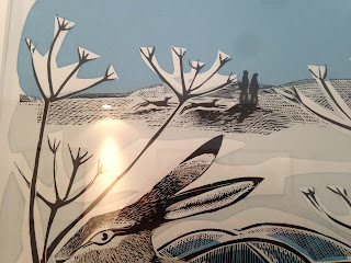
I managed to buy this image on a tea towel at the York Art Gallery! It is really interesting because my friend that came with me liked the images that told a story and wasnt too fussed about the beautiful images. I guess she definitely is an illustrator and I am more of an image maker.

 I like that she has left cut outs of very lose shapes before adding the detail on top and it doesnt matter if everything doesnt line up properly, it just makes it more interesting an image.
 These are her block prints for the A-Z she did of different birds. They are wood blocks and to be honest they are just as nice as the prints! It is lovely that they have such texture and depth to them and I would definitely find them interesting to be displayed as final pieces rather than just the process because they are so beautifully crafted.
 Her sketchbooks are interesting because her drawing style is soooo loose and rough which contrasts deeply with the precistness and detail of her prints.

 The lines built up just perfectly represents the water. I really like the limited colour palette here and the cross hatching used.
 My parents came to this exhibition earlier this term and bought this image. It is called Foxes at Marske Hall. I really love the contrast of the orange and green but also the detail in the leaves as well as the for-ground and background. It is a very dense image but just so interesting to look at.
Here I like how the silkscreen print spills over the very detailed woodcut making a softer more colourful edge. I think the use of colour in the for-ground in comparison to the black in the background is very clever. The direction of the lines really add to showing how windy the day is.

 This is interesting. She must have played around with the silkscreen, rubbing bits out/ smudging them and this adds a looser and interesting effect to the image.

 Also visited another exhibition about art emailed in from repressed countries. I thought this was an interesting was of displaying feedback. It all looks very neat and tidy, like an installation itself. I took this photo to show my friend who is on Fine Art with a curating module coming up.
 This is really interesting because although they are identical sculptures, they are placed under a massive tree and this weathering really did effect the colour of the seated. I guess that this must have been deliberate because there was room for it to be spread out further but it really portrays the impact of sunlight.
This is a really stunning mosaic, in part of the park which I havent visited before. The colours are just amazing. One side was day and the other side was night. To me this looks like the inside of a flower but it also could be a crazy lady dancing. I think the colours are just amazing and I love how the image is built up off different sections.

York Gallery

YORK
Had a lovely day trip to rainy York.
Me and my friend saw that there was an exhibition at the York Art Gallery called FLESH.
This was very interesting! There were pieces of art from Bacon, Chardin, Degas, Lucas, Nauman, Rodin and Rubens. There were 3 different rooms and they were a mixture of 3D, paintings, video instillations and prints all on the theme of animal/ human flash.
There were some things which stood out and still haunt me to this day! I managed to have a disgusted expression on my face the whole time and unlike my friend who thought the exhibition was amazing thought it was just gross!

  • Photographs/jars of tattoos which have had the layer of skin scraped off to keep them once the person has died
  • A series of photographs about people cutting them selves/sewing themselves together
  • A cast dead decomposing dear 
  • A stop motion video of a rabbit hung upside-down and maggots eating it from its stomach out (URGH)
  • An old naked man walking around wearing an african mask
  • A huge 3D painting of different intestines and different organs- very strange and life like
  • Flesh resemblant of a mother holding a child which was made out of wire, fluff and tights
  • A series of self portraits in which the artist documented her weight loss and weight gain to challenge the contemporary body image

I was very glad to leave this exhibition, it made me very queasy! We had a wonder round other parts of the gallery and it turns out that Mark Hearld had curated 'The Lumber Room-Unimaginable treasures. This was really interesting! Turns out Mark Hearld is a "york based" artist. I really enjoyed this room! I have seen a lot of his work before but only the finished pieces, here there were displays of his sketchbook and collage books of stuff he has collected as inspiration but also the massive collages that were on the wall were not scanned and made perfect so you could see all of the different textures and the scale that he works at!

Saturday, 4 February 2017

6th Street

6th Street

Here I was commissioned from Leicester University to create an image in response to a book about a dodgy street which was sanctuary for people to hide after illegal activity. I was commissioned this because the book had images but they weren't allowed to be used.
I immediately had an idea of how I wanted the image to turn out and hunted for a run down american ghetto street photo.
I wasn't to concerned of the straightness of the lines and just started in the middle of the image and worked my way out. This didn't take me too long and then a bit later on I came in with black ink. I thought this was an atmospheric colour. The watered down ink left some interesting mark making which added to the atmosphere and on the other hand the dry ink left some very interesting marks which added to the aesthetic also.


I then scanned the image in and edited it a bit on photoshop. I am happy that I have an understanding of photoshop now as it just makes that little bit of a difference. I changed the colour to greyscale so that there wasn't any different shades of colour within the black and magic blended elements and also enhanced the tonal variation a bit. It just makes it look that little bit more professional!