Sunday, 30 July 2017

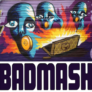
Badmash graffiti cover

Badmash Album Cover

Here I was trying to turn my graffiti into an album cover for our band. We wanted to use this to release our songs on Soundcloud. It kind of matches the vibe of our band (A four piece band formed in Leeds, delivering sounds drenched in rhythm and angsty rock vibes). Further more the main song from our first release is called Pandoras box and wasn't a deliberate connection with the piece of art but just worked really well.
 Because my artwork is horizontal I thought we could add our band name alongside to make it square. This was more complicated than anticipated because composition and band members views had to be considered.
Using newly acquired photoshop skills I managed to; colour the lettering, move it around with different spacing in between the image and the outside, stretch the lettering.


It was when another font was brought into the mix that we decided that this wasn't something that could be rushed as it is an important part of the bands identity and should be considered carefully.


Friday, 14 July 2017

CD Cover Task

CD Cover Task
1. 
  Go to wikipedia.org, choose English, and click Random article.
      The first random article you get is the name of your band.
2.   Go to quotationspage.com and click Random Quotes.
      The last four or five words of the very last quote of the page
      is the title of your first album.
3.   Go to yahoo.com and search “random image” or flickr.com . The third picture –
      no matter what it is – will be your album cover.
4.   Use Photoshop or similar to put it all together.
5.   Resolution: 72 ppi, 768 x 768 pixels, Format: jpg, step 10 or 12
6.   Name: yours (e.g.: johannes.jpg)


I think that this is a really interesting task for me to do considering how much I love music and have a vast collection of CDs. I have never really considered type well before but after the lectures I have had at the summer school in Berlin I felt that it was something I should try. This task also encourages me to explore photoshop further which is something I am still not confident with! It is different to work with someone else's imagery and I hope that this will help me transfer elements to my design in the future.

1.Rich Lake.not work as expected


 I wanted to turn this into a psychedelic style album cover, I thought this was fitting. Therefore I wanted the lettering to stand out more from the background with a coloured outline. Neither me nor the teacher knew how to do this is Photoshop so he suggested that I moved over to InDesign...
I figured out that if I turned my original image to multiply, everything lighter than the would be replaced. This was an extremely easy way of adding yellow to the cover.
This is so far on InDesign... I need to figure out the letters and I am thinking about creating a border/frame.
I am not sure that I like this result. I think that I might go back to the black and white image and maybe add some colourful flowers or a pschadellic pattern onto with my Wacom tablet.

Kramies

version is complete

I imagine this album to be an obscure and mellow artist (a guy with a guitar) who people either love or hate... Someone a bit like Elbow... This random image is quite cool and perfect for an album cover image because it is quickly and random, like someone who is trying to be indie and cool might chose.
I went with the broccoli themed colours but wanted to create an automated effect with the text because the words are quite robotic.

Electrologica

rinse my mouth out


I wanted to try and make the background of the image like different blocks of colour to insinuate an electronic feel. I found that this colour scheme didn't work and that it interfered with the clarity of the face too much. 
I liked that the face was on one vertical half but the pipe goes into the second half as this makes the face not seem out of place.


I found that if I highlighted the album name over the top of the squares that it created this interesting textured, darker stripy pattern which I liked so I screen-shotted it. I then looked at other electronic music album covers and found that the font they used was something similar to that I have chosen for the album title. However looking back maybe I should have them the other way around.
I felt that although the black and white contrast was interesting the white got lost so I decided to add a frame to the image which I think works well considering the line work of the face and pipe.

infrared spectroscopy

 fight for equality
This picture and the album title go really well together... It is a picture of a strange human being with a map of the world insinuation to respect people of all dimensions, from different backgrounds and cultures. I am lucky with this combination!
I imagine this band to be quite hippy and well travelled, including some Sitar or something similar, and that they produce and quirky experimental sound...wigging out and playing wacky chords on the guitar and keyboard.
 Furthermore I thought it would be easy to add some Infra-red into the mix through the eye sight, changing the iris colour to red. This didn't make enough of a statement though...
I thought it would be a good contrast to use so fat lines so draw around the eyes in red. I started off with rays of infra-red radiating/going into the eyes and then thought I could add attention to the sight by outlining the eyes some more but adding some off balance through the uneven eyebrows.
 I then thought that perhaps adding some tone into the image could be a good thing by using a darker shade (to not add too much colour I took the colour scheme off the mouth as the image already has lots of colours). But I decided that this was too much and that it was more striking and impacting to had less lines.
Then came the positioning of the text. I decided that the type would work well at the top of the page, filling it all away for the band name. I then struggled with the positioning of the album title. It didn't look right in the centre as then everything was too cemetrical. I thought maybe it could work aligned with the lips because it looked too balanced at the bottom corner. 
I thought that the font should be simple and clear, especially as the album title is such a bold statement but that it should have some character to it.
However I decided that it worked best placed underneath the title in the corner. Partly this balanced out the line work of the left eyebrow but also because the weight is at the top then and it breaks up the red of the band name and the eyes (which is also balanced at the bottom with the lips...dividing the image horizontally into quarters). I thought that the album title should be in white so that it stood out but also picks the white out of the eyes more. 

TRANSFORMART + Felix Gephart

Transformart

We really wanted to visit our tutors exhibition. He is a such a cool dude we wanted to see him work exhibited! It was an extreme expedition and we got extremely lost and it took us 2 hours to get there. It turns out that it was in a place called Oberschoeneweide which is outside of Berlin!
It was such a rich experience and it was so nice to see an authentic exhibition of contemporary artwork from recognised artists from all different practices. It was based in multiple warehouses!

In the first room we went to everything was layout like a floor plan..
This installation was entitles 'Who decides if you hate?'. They wanted to create an interactive installation in which people came and sat in the bed and took a selfie of them doing so whilst watching a video of the couple re-enacting the famous John Lennon and Yoko Onos 'Make Love not War'.
It was absolutely bizarre getting on a bed in front of a whole room of people and taking a photo. It really made me question privacy and intimacy and strangers.

Then we went to the room of our graffiti teacher. You could see immediately that it was his work by looking through the room written about above!
He shared an exhibition space with his brother (who is extremely similar to him). They have always been a pair! His brother is a few years older than him and he taught him how to make graffiti... There are photos of them at it in his bother Matthews photography book. His brother is more focused on Graffiti, uraban lettering and photography rather than Felix who grew up with this but did a degree in Illustration/Graphic Design where he hid that he did Graffiti for a while as it was thought of as "respectable". However they do collaborate and they still create pieces together and you can tell that they are strong influences on each other... They also are teenage adults... They are both very much still part of the hip-hop culture (had hip-hop as their background music) and both came to their exhibition dressed all in black with t-shirt with urban graphic art on. His brother had long hair, piercings and a cap (even-though his is 45)! They are definitely young at heart and the easiest people to have a laugh and conversation with.
You can really tell that Felix's work has been strongly influenced by his Graffiti and Hip-hop upbringing. Most of his work is greyscale. In class he talked us through his work book and it was amazing to see the scale of the paintings outside of the book! I did not imagine them to be so large, but then again he works big when he does Graffiti...
This fire piece is crazily good! Fire is one of the hardest things to capture but he has the flames down to a T. He explained that the figure is the background layer and was protected when he was creating the fire with a sheet which kept the edges sharp. 
In his illustration work he doesn't use a spray can. This originated from when he was studying and it wasn't allowed to use a spray can in his studio... This lead him to use a toothbrush that he flicked as this created a similar effect and this is how he created the flames here.
I really like the pattern that he created for the background of the image- he has created a texture. Also the way that he created form through the direction of his lines. Furthermore the choice of white highlights on a black background gives the figure a more exhausted/unhappy/ struggling expression (it was look like a very different piece if inverted) 
All of his figures are created from imagination but he has an extreme and atomical understanding of the human form. This is something he taught himself after university as he found this to be an important skill that he wasn't taught for example which muscles goes where and when it is used.
I liked this section of the piece because of the body language and expressions of the figures but also because pf the building in the background. There is still detail on the building in the background (which is a different way of visualising this kind of building than I would) but it is faded and you can see the smoke covering some of it.
His visual language is very much using the same principles as spray painting with the outlines and use of white on-top of black and creating tone through directional lines.
In fact his illsutration practice has transferred into creating memorials. He has taught us about illegal and legal graffiti/uraban art and he has found spots where he can create illustrated graffiti pieces (over a long period of time). As you can appreciate it takes a long time creating graffiti because of all of the different layers and the police have an easy job if they see an unfinished illegal piece of graffiti as the know the artist is going to come back.
It is very clear to see how he has transferred his illustrative skills to the spray can and in-fact they have clearly influenced each-other through the years.
He has also created quite a lot of satirical pieces (as evident in his book) and he holds some strong but moral political views. This is important for his Graffiti work because he can can respond to situations as they happen... for example a piece of graffiti about Putin after the pussy Riot Scandal.


I couldn't resist but to buy a book from his exhibition. He had talked us through the different commissions and it would be a really good token to take away from this experience. 
More excitingly he wrote a personalised message!!!
This is an image that he was commissioned to produce as an advertisement. Cleverly, I think, he used a stamp of their logo to build up shade within the image. The logo of the company is basically what makes up this image!
This is an example of a Gephart brother collaboration. His brother does the type in the middle which is very hiphop influenced and Felix did the figures on either side and then his brother took the final photograph.
He also taught us about the importance of collaborating with different  practices. He said that with this set of photographs he didn't have a budget but could trade experiences. He needed a modal to study, he had a friend who was a photographer and practice and experience taking pictures and a model who needed photographs for a portfolio. Therefore they all collaborated and all got the experience they needed from the photos. 

He advised to 100% make friends with a photographer!!! In fact I met this photographer at the exhibition (graduate from England and they met at a life drawing class---still learning!) and he gave me some words of wisdom... You really need to embrace the facilities at university. Although the inductions are long and take up a lot of time and you would prefer to hang out with friends it is important to invest time because otherwise you will have to teach yourself how to screen-print etc. afterwards. These are things that need to be in your skill set even if you don't think you'll need it because clients might want it and its a lot harder when you are left on your own... He then said I know you won't because I told myself that every year and never did...
This is relevant as there are things I regret not doing this year, majorly the workshops...
 A lot commissions that Felix has had have been Literary drawings. This particular piece is from 'American Psycho' that he was asked to illustrate scenes from. 
This is an example of his subtle usage of colour but importantly the use of white space. He said it is very important to give the reader parts to imagine as that is what keeps them interested. Also leaving parts out can make a bigger impact than putting them in, especially when it is such a stark contrast as a very tonal chair.
He strongly advised us to create things as analogue as possible. With these illustrations he has sold most of the originals at high prices to a collector but can also sell prints for less but more of them!

There were lots of different warehouses and we explored them all. This was a room which I really liked. There were lots of figures in different positions and we were being serenaded by a Harpsichord. This was strange because you wanted to walk around and see all of the different exhibits BUT there were people standing all around the walls and you didn't want to block their sight but you kind of had to..

I really liked these figures and how the different the body language between the lady and man show what is going on. In fact one of the pieces looks like they are dancing and it reminded me of the drawings I did in Madrid of the flamenco dancers.

I really liked this exhibit. It was really difficult to photograph but it is very simple outlines of  figures in a range of positions that we humans make everyday, out of copper wire.
I am not sure why I haven't thought of this before but I have done some much continuous line drawing work and have explored figures and dancing that I should have ago at using wire to create some figures! To see how simple or complicated I can make them, and look at faces as well as the whole body!

Something that has been an ongoing exploration for me is how to layer things. I thought that these pieces were a really interest way of having different levels and they use a combination of different media with some textured/patterned and some flat colour.
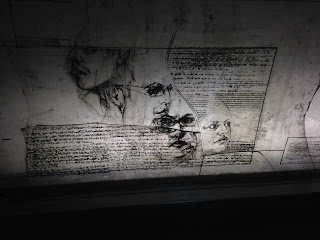
I found this interesting and how the artist combined words and faces. It is something that is very relevant to what I have learnt from this summer course because we have been studying faces (theirs obviously a totally different level to use) and we have learnt about 'Palimpsest'. I also find it really interesting that they have divided their image into blocks so that the words are a shape. 
I think this piece gives the effect of a really old tea stained letter that is being investigated under an overhead projector. There is also very few dense lines (drawn and of words) and a lot of empty space.
Claudia Vitari