Tuesday, 20 December 2016

Images for Leicester University

Leicester University Website

CERD
My brief for these images was for a course about research ethics. Some of the briefs were more abstract and some more concrete. 

The more abstract ones were the 4 traditions of ethical thinking, which formed framework for evaluating research studies. This ended up as the CERD framework with linocuts for each dimension. 

Theses linocuts used block colours, focusing on shape which worked well with this type of printing. They also needed to be simple images because they were going to be small, almost Logos. I did this right at the beginning of the year, starting the project before I came to university but they have just been published in the MOOC (massive open online course) and I feel that if I did them again now I would be able to consider composition better. Also the prints crinkled on the scanner so they seem like they are creating an optical illusion. However the narrative I had to portray visually was quite a challenge. In all of the images to enforce simplicity I limited each image to different tones of the same colour but to enforce individuality I made the images different colours.


Here I used the classic symbols of weights to create balance and perspective on things.

This is portraying different opportunities and choices through a mind map with different branches/paths.

Here I wanted to play on the classic 'toilet' symbol of a stick man, however as it is in an ethical context I had to also include a female. They couldn't be holding hands because I needed to respect LGBT. 

This was to portray choice and individuality, so therefore I created an almost ballot in the background showing its okay for people to make different choices.


EDUCATIONAL ETHICAL RESEARCH

The more concrete briefs were issues illustrated in educational contexts and hence related to different hierarchies of people in a school setting: the headteacher, deputy head teachers, middle leaders, teachers planning together and children as students. These images became reusable and were useful to show the way researchers look in on practice as outsiders or invite participants in.

This was a project I created right at the beginning of first term and since this I feel I have learnt a lot about character design and simplification to create characters. These are all images I have drawn from a collection of images. I used the photos for reference and collaged them together to create compositions different to the images through my illustrations. In these images I needed to consider different religions, genders and nationalities. I also hadn't really discovered photoshop and feel that they could have done with some colour enhancing and cleaning up of the watercolour.


The hands image needed to show people reaching out to other people and building relationships. I was took inspiration from an installation in an art gallery in Berlin which was a sculpture of different hands reaching up.This is the first time I had really drawn hands and used photoshop outside of university. I liked the use of fine liner lines and the white space of the hands. I also used a circle in the background because it as a shape represents never ending connection and progression and felt that as a block of colour it really added to the composition.

HANDS


Wednesday, 14 December 2016

Study Task 4 Books

BOOKS

Fiction
A Flower Fairy Alphabet-Cicely Mary Barker
I feel like this book and the illustrations may be a bit outdated however it was a book I used to love to look at when I was younger. I was fascinated by the fairies and how their outfits matched the flowers and I decided which flowers I liked most due to the fairies in the images. 
We also have 'The complete book of the flower fairies' by the same artist which I got in 2001 for my 3rd birthday. When looking through my old bookshelf at home I came across this book and it made me nostalgic to when I was looking at it as a child so I chose this book because I used to look at this book every day for years (driving my parents mad). To this day still looking at the imagery there is something majestic about some of the illustrations, they are just so damn beautiful. I think also it was a foreshadowing for my interest in Art Nouveau as there are definitely elements of that style here.
I would describe this as a fiction book because on the accompanying page there is a little poem which tells a story about each fairy.


Non-Fiction
The Wild Flowers of Britain and Northern Europe- Richard Fitter, Alastair Fitter and Marjorie Blamey
This book is aimed at people who are interested in nature so that they can identify different flowers as they see them when on walks etc. The illustrations inside are so detailed they could be photographic however they capture a sense of beauty by being hand drawn.
My family are very interested in walking and exploring different places. My mum has always been disappointed in my lack of interest in all of the bird books that she has but has always commented on my interest in flowers. Apparently when I was younger I used to stare and stare at this book. I still love flowers, a lot! Since then I have used this as inspiration for drawings and in my GCSE art project where I crafted 3D flowers inspired by these drawings. The bind of this book is almost falling to pieces (the copy we have is from 1974 which mum used for botony at uni). 
In the book there is a page of multiple different flowers in a specific group (with close ups of the flower heads and the stalks and different varieties) and then on the accompanying page there is the latin name, a description and scientific terminology.


Picture Book
Illustrations for Le Morte Darthur- Aubrey Beardsley
I came across this book from my parents book shelves when I did an art nouveau project for GCSE and began exploring lino cutting. This book is from 1983 which my dad used at uni.
Everything within these illustrations focuses on line quality and use of space/ blocks. It is all printed in black and without many words at all as the images illustrate the story of King Arthur).
Each page is layed out with different presentation- opening with an amazing floral border surround a small summary of the chapter and following pages which have rectangular images of different sizes layed out in an unusual structure.
I find this book incredibly striking and each image (doesn't matter how small) has so many things going on but still in a minimalist nature.


Self Published
101 Artists to Listen to Before You Die- Ricardo Cavolo
This book I came across in Village in Leeds and there was no way I wasn't taking this home with me..
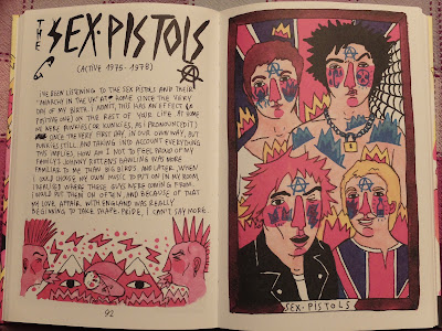
It goes through in chronological order of all of the great musical artists that the author likes (great taste). One one side he writes why he chose this musical artist and how it makes him feel (like a diary entry) and on the other side draws the musicals and incorporates the imagery he conjured up in the text. The supporting text is written in his handwriting in capitals and he has left in crossings out which gives it a very friendly/ informal.
The images are just so fun. They are so colourful and although every person looks very similar but with differnt coloured hair it works. There are just so many variations on the same principles that it is really interesting to see how he adds unusual things to each illustration. I feel that he manages to capture the music genre and the music in each piece extremely creatively! I also like the strip of imagery underneath the text which just sums up everything he has said and how he feels in such a vibrant way and with these he only uses 2 tones.
This book is obviously for people who are into music and that appreciate "the classics".
I have enjoyed reading the book so much (it makes me smile) and I have shown in to about 10 different people and forced them to look through it.


Tuesday, 22 November 2016

Life Drawing

Life Drawing Class

My friend who studies Fine Art at Leeds Uni invited me to go with her friends to a life drawing class at the pub-why not??

I have only done life drawing once before. What I remembered was the instruction to try and use strong dark lines to show muscles and strength and thinner rough lines to illustrate light and softness.

15 min drawings x4
 25 min drawings x2


Sunday, 20 November 2016

Study Task 3 Applied Illustration


FUNCTIONAL IMAGES

'The Banana' album cover of for the Velvet Underground is an interesting piece of functional imagery. 
It was a silk screen print designed by Andy Warhol which importantly gave his 'stamp of approval'. He used a very simple image of a banana but very controversially used its connotations to make the cover erotic through the use of an erect banana alongside an evocative instruction saying 'peel slowly and see'. This revealed a bare banana underneath. This turned out to be a nightmare to make because the sticker had to be hand stuck and so it was dropped after a year of the original release (which was 1967). It is a very simple piece of illustration but it is striking and there is such a strong message associated with it. At the time this album cover was ignored but now it is iconic and regarded as a critically acclaimed cover.


This is another functional image because it is promoting a gig. It combines eye catching imagery with information of the date, location, band and time in a very visual way. It includes the iconic album cover that all Doors fans know and love but has created in within an art nouveau style. I feel that this poster is greatly inspired by Alphonse Mucha (an art nouveau artist)- The use of layout with the curved edge over his head, the plants creating up the side in the mark making style used and the swirl as a border. 


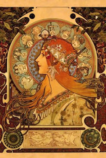
This summer I went to the Alfonse Mucha museum in Prague. I found this poster very striking. Mucha made 2 promotional posters for Job cigarettes. I think that this image is very clever-so many layers to it. This is a functional poster as it promotes the cigarettes but also is a beautiful image. He builds up the background pattern through the logo of the cigarettes. The smoke from the cigarette also evokes into her hair as if her hair is a cloud of smoke. This feature of her her, according to 'Alfonse Mucha' written by Sandra Mucha was referred to as 'Much's Macaroni'. Because it is art nouveau style that lady is depicted as beautiful and glamorous and furthermore promotes smoking. 

This is another example of an applied illustration- a book cover. This book is all about how going to war changed peoples lives. I think that this lino cut is beautiful. I think that it really creates atmosphere of war (the grey smudges). It is also very subtle by putting the figures in silhouette and looking down/facing away. The use of lino cut is very impacting because the roughness of the lines and their directions furthermore insinuates distress and tension. Also the use of 2 colours is effective at creating a solum mood.

This is an example of illustrations being applied to a product-in this case clothing. I came across Alina Zamanova through a flash print sale in which I bought a print. She is a predominantly a fashion illustrator. This means that a lot of her work is extremely expensive to purchase even though her product are very cool- I think Rhianna has worn a piece of her clothing!
This is very clever because it is making plain, boring knitwear interesting through the application of one image. Therefore she is taking her own twist on the consumer fashion. They also are not beautiful images-perhaps making a statement on feminism and identity.

Here I like the layout of this image. It originally had multiple figures but here she has made it fit the back of the coat. I think the limited use of colour is gorgeous and the striking block colours contrasting with thin line details.

I like that here the image fills the whole of the body suit in a very fun and colourful way. This image is not only promotional of the clothing but could arguably be a piece of art work in its self as a photograph due to the face paint and the original piece she is lying on.

This is another example of above in that her artwork is the background and the dress.