FUNCTIONAL IMAGES
'The Banana' album cover of for the Velvet Underground is an interesting piece of functional imagery.
It was a silk screen print designed by Andy Warhol which importantly gave his 'stamp of approval'. He used a very simple image of a banana but very controversially used its connotations to make the cover erotic through the use of an erect banana alongside an evocative instruction saying 'peel slowly and see'. This revealed a bare banana underneath. This turned out to be a nightmare to make because the sticker had to be hand stuck and so it was dropped after a year of the original release (which was 1967). It is a very simple piece of illustration but it is striking and there is such a strong message associated with it. At the time this album cover was ignored but now it is iconic and regarded as a critically acclaimed cover.
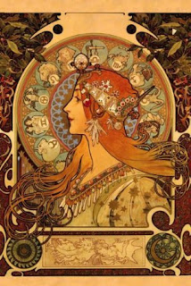
This is another functional image because it is promoting a gig. It combines eye catching imagery with information of the date, location, band and time in a very visual way. It includes the iconic album cover that all Doors fans know and love but has created in within an art nouveau style. I feel that this poster is greatly inspired by Alphonse Mucha (an art nouveau artist)- The use of layout with the curved edge over his head, the plants creating up the side in the mark making style used and the swirl as a border.
This summer I went to the Alfonse Mucha museum in Prague. I found this poster very striking. Mucha made 2 promotional posters for Job cigarettes. I think that this image is very clever-so many layers to it. This is a functional poster as it promotes the cigarettes but also is a beautiful image. He builds up the background pattern through the logo of the cigarettes. The smoke from the cigarette also evokes into her hair as if her hair is a cloud of smoke. This feature of her her, according to 'Alfonse Mucha' written by Sandra Mucha was referred to as 'Much's Macaroni'. Because it is art nouveau style that lady is depicted as beautiful and glamorous and furthermore promotes smoking.
This is another example of an applied illustration- a book cover. This book is all about how going to war changed peoples lives. I think that this lino cut is beautiful. I think that it really creates atmosphere of war (the grey smudges). It is also very subtle by putting the figures in silhouette and looking down/facing away. The use of lino cut is very impacting because the roughness of the lines and their directions furthermore insinuates distress and tension. Also the use of 2 colours is effective at creating a solum mood.
This is an example of illustrations being applied to a product-in this case clothing. I came across Alina Zamanova through a flash print sale in which I bought a print. She is a predominantly a fashion illustrator. This means that a lot of her work is extremely expensive to purchase even though her product are very cool- I think Rhianna has worn a piece of her clothing!
 |
| This is another example of above in that her artwork is the background and the dress. |


No comments:
Post a Comment