Louise Lockhart
Louise Lockhart came into uni to give us a lecture about her career and I found this really interesting.
She hasn't managed to get an Agent and has now tried and given up. She seems to be very independent and resilient though because she is a full-time illustrator and has been given some very interesting briefs and a range of them. She created her own "brand" called 'the Printed Peanut'.
I think it is really inspirational how hard she tried to get where she is now, through waitressing and doing work for free (which I know is what most illustrators have to do to get their name "out there" initally).
I really liked that she set up her own screen printing "studio" in her bathroom and I that she started to put her images onto products through Print all over me and Society 6 which I think is a cool way to feel like you have achieved something and push what you are used to.
Another cool thing she does is enter 'Secret 7's' which I had never heard of but has a competition for 7 singles for the album covers each year- she even won one! Album covers are something that would be AMAZING to do so I may consider entering this at some point...
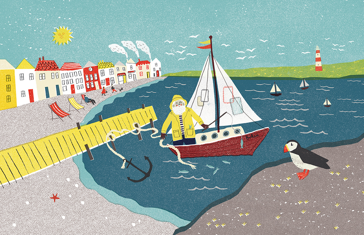
She has had some really sweet commissions, for example Boden wanted her to make an image which was interactive of a sea-side scene.
She has also gone down a very specialist route through the use of Paper cuts. I knew about using paper cuts for layers of a collage and laser cuts (which is pretty much the inverse) but her paper cuts have a really nice quality to them and was rather inspirational.
She also has been collecting textures of basic things like letters through the door and book covers which she can then put onto her work through photoshop to add texture. This is a simple idea but very effective. She said she uses photoshop to add colour to her images as well.
Her interests are shown strongly through her work. She has a passion for shop fronts and food... She has also come up with some very creative ideas to sell like illustrated forfeits in a game of Pass the parcel. This is an aspect of where he work goes into product design.
She also uses Risographs in her work which again I hadn't heard of but they have a beautiful quality to them! They are digital prints which look hand crafted...I have also learnt that there is a place called 'Footprint' which prints these.
How full of life is this illustration! It really captures the music that they are creating, it is very colourful but with a limited palette so that the image doesn't look too chaotic! I would love to create something like this! I also love that nothing is flat colour, everything is built up of patterns/textures and even the blocks of colour, due to the risograph prints, are textured!
Her advice to us was to network with other illustrators throughout our careers by going to events like Print Fairs and meeting people.