Sunday, 30 April 2017

Illustrated Self development

Illustrated Self development

This is in many respects similar to the Delia Derbyshire project completed for Visual Communication however this is just more difficult because it is me and difficult to research and put into perspective. I coped well with the Persons of Note brief because I could directly link things and then explore from that. In this brief everything is very close to home and there aren't google pages which I could extract words from. Therefore I decided that I would find out my own research through asking people 1) Who am I? 2) Who am I to you?
I appreciate that this isn't a totally honest portrayal of my character because the messages were asked by me and sent to me. However it doesn't matter because a portrayal of myself in a poster with negative responses. I also found it harder than I expected to receive such an intense burst of comments on myself and my personality.
 I had to start somewhere with visualisation and thought I would start with the obvious portrayal of my hobbies as they build who I am and my identity. These are aspects of me that are identified by the people I asked responses from. I have found that continuous line drawings are a good way of starting drawing. It doesn't really look like the people of our band although it does have their important features.
 I then thought I would try the other band, also a continuous line drawing but in orange (my hair colour) and coloured pencil with some rough visualising of the curtains. Both bands are important because they have a very different dynamic. The bluegrass band is new and different, since starting uni and we just cover songs. The band below is like the bands I have been in through 6th form, we write songs and it is reflective of the music I enjoy singing and I love the live performing.
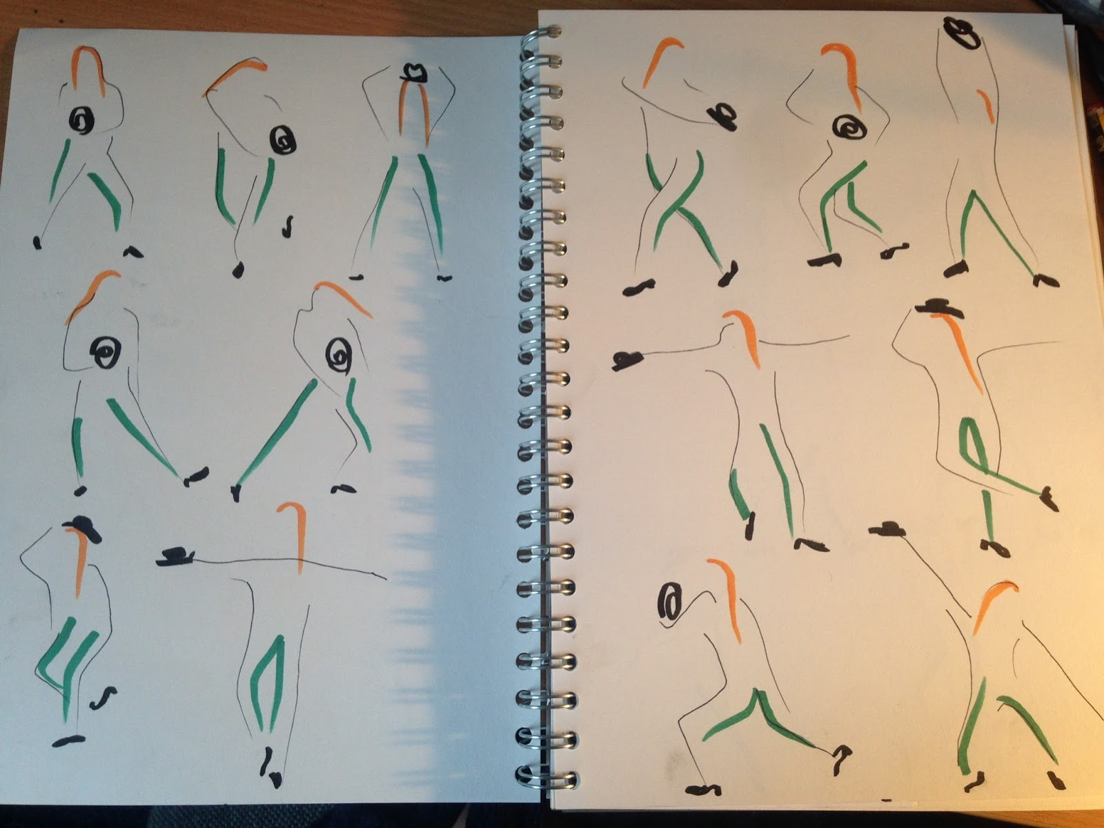
 I wanted to record my tap dancing. I came across a video of me performing and wanted to record it. I found that my flamenco dancers captured movement, strength and rhythm and I wanted to capture this in my tap dancing. In the video I am wearing my favourite green trousers and having orange hair so portraying this captures a stereotype of who I am and makes the figures recognisable as me. I made sure that the shoes and hat were in black as a common feature through everything. In tap rhythm is everything and therefore the tap shoes are vital to being a prominent feature. I felt that I have managed to show weight and movement through their shape. The hat is also good at capturing the genre of music (jazz/blues), reflecting what I enjoy tap dancing to. As I found in my flamenco dancers the line quality of the brush strokes captures movement through the hair and the movement of the legs. I wanted to do an exhaustive few pages as tap dancing isn't a static dance and can't be captured in one drawing because it is a process of movement and expression.
 To continue this I put them on photoshop to create a strip as maybe this dance could be a border, like a story board, a frame.
 Something I am very passionate about are patterns as they are a huge part of my happiness and identity. I wear patterns because when I look at them they make me happy and therefore I can be a "source of energy and positivity", "colourful clothes and aura". I also really like the textures of the clothing that I wear as well as their colour so tried to illustrate both.
 This to me looks like "radiating happiness" and being a "source of energy". It is an explosion of colour. It also has a plan, an outline, limitations, a guide line. It is "organised" but still "all over the place"
From this I think it could word as a good design. I like that the colour stops and there is just a dark, plain background colour. I think that the background would work well as grey. It really portrays the "up and high" but also shows the dark side, where the M.E is a ghost and haunting. The side that I don't let people see because I "try to be happy" but I'm human and not all of the time. I learnt how to seem happy after the downs of this year. I also thought it would work well to include the German element of me as Germany isn't a too dissimilar shape to the circles and will break up the rings. It is something that is subtle to my personality but deeply ingrained so working as a background shape would portray this well.
 This is a pattern inspired by my favourite skirt in the whole entire world. It is so messy and busy (a bit like me and also my brain) but also organised and categorised into different sections (a bit like how I process information).Needs to have strong lines to show "right or wrong" and "dependable/loyal"
=
This pattern alone reflects my personality. Bright yellow but with some undertones of dormant energy and happiness. There are busts of colour and excitement and energy. There is orange which is my hair and green for my eyes. I am a but sceptical of creating a digital poster because I live in an analogue world: CDs, Vinyl, Collages, things printed out, postcards, handwriting...
I decided to hit photoshop and record some more patterns. I wanted to see how the patterns would translate digitally as these images are quite complex to drawing and line quality wouldn't add to the aesthetic. Although this is all individually drawn each flower is hand crafted. 

Maybe these patterns can become some of the circles in the energy source layout? Colours needing to include: green (favourite colour and eyes), orange (hair colour), yellow (brightness and enthusiasm), blue (has featured in everything so far). Turns out that these are pairs of complimentary colours.

My bedroom is a large part of who I am. It has always been colourful and full of inspiration and recognisable. Its mess because I have everything important to me around me (thats what I tell myself anyways).
I have my favourite pieces of art work that I have produced on the wall; my tap dancers, my bluegrass band figures, my doors screen print and the Delia Derbyshire postcards. I also have a bluegrass poem, the cassette tape front cover which I destroyed and a business card from my friends DJ night. I have a poster made by my next door neighbour on animation portraying the dynamic of next doors flat before everything turned on its head and a poster of nudists from thought-bubble. Along side this record cover insists and CD posters and Jim Morrison. Obviously can't forget the very recognisable Pear that I got for Christmas... Most importantly a hand drawn monthy plan that is my rock and under it a to do list. Lots of cups tea/coffee which I never get round to washing up and also pens everywhere.
 I really love having visual stimuli around me, everywhere and when I came to uni I had 253 postcards so I can't imagine what the number is now. Yes they fall off and yes I have a stack of ones that I can't fit anywhere... They consist of Art Nouveau-Posters-William Morris-Pictures of musicians-Van Gogh- Picasso-Kandisky-beautiful cars from local artists.

Wednesday, 26 April 2017

Critical Incident- Jazz/Blues

Jazz and blues night

I just went to a jazz and blues society performance.
For the first time I felt the emotion of Jealousy. This was not nice and not justified either.
This emotion is not something which I want to be associated with me and it is not okay that I have felt this. This isn't part of my identity but maybe to some degree it is and I don't like that.

I feel that it is really important for me to dwell on this because it has weirded me out. I want to analyse this so that I can process this and make sense of it so that it never happens again.
Jazz/blues is my go-to when it comes to music. Its not that I listen to lots of it but it is how I write music and sing when I have the free reign almost like it is my natural genre and my comfort zone, what I feel. I also played the clarinet for years and only could really engage with the jazz and blues side of the exam board.

I was just enjoying listening to some beautiful heartfelt improv and tunes. Normally when a singer comes on stage I can be like WOW they are incredible, I totally respect them, they are amazing at what they do and how they do it. Inside I know that they sing in a different way to me and so I cant compare myself to them. For the first time tonight there was a female singer who hit a nerve. She sang to similarly to me and she was incredible, literally like she was recorded in the 1940s and was being played off a record. To make things worse my go to song to sing is Summertime (Gerschwin) and she sang it and it was too much! Furthermore she does art history at Leeds Uni so this isn't even her profession, a hobby. Perhaps this has freaked me out that because I come from a tiny village not and wasn't part of a large city in any respect that I didn't really appreciate how much talent there is in the world? It is weird that at home I was known as Alex, the singer or Maraca girl but coming to university nobody knows that part of me and until I found my 2 bands it really wasn't part of my identity even though it is so thoroughly who I am. That I can have been seeing someone for months and they had never heard me sing. Its not that I want praise because I am too much of a perfectionist to ever revel in it but just because singing and music is a large part of who I am.

At current I am not in a good place because I am recording for one band tomorrow but my voice is a total mess. I have a hacking cough and have realised that I don't have control over my voice which is something that is one of my attributes maybe (I am not very good at talking about my singing confidently as people have said in my mind-map impressions research) and singing has been one of my main identities forever and the only rock that I have had even through when I had ME, I could always sing. It is scaring me that it is not itself at the moment and this must be to do with smoking and my awful health. I need to quit. My bluegrass band is getting some paid Gigs and I need to be confident enough that I am worthy to be paid and that I am good enough to perform. I guess that sitting there not in a position where I can sing to what I can be didn't help the situation...

So I am having a battle with myself.
I am extremely inspired by watching this evening realising that I need to join the jazz/blues society (probably next year though as I need to have my voice back and I have enough on my plate at the moment and they year is drawing to a close).
It is making my analyse what music is to me. I have never been someone to go to many Gigs, I used to go and watch West End musicals and dance shows when everyone else began going to Gigs. This is possibly because I never really listened to music from bands that are up and coming and popular so presumed that they would never perform. I have been performing through out secondary and 6th form and my 6th form band performed multiple times before I had even watched a Gig and what a band performance should be like. Even through this I was watching how they held the stage and captured the audience so that I could use my reflections.
I also tend to listen to bands that have male vocalists, so that I can enjoy them as I can't identify with them. This is a horrible realisation to have but it seems I compare and my brain tries to draw advice from every piece of music and I have to be able to distance myself to enjoy it. The female vocalists that I do listen to have a very different voice to me and aren't things that I can sing well.

I am really not a competitive person and everything is about self improvement I guess to reach that one day where I am confident in my practice, to ful-fill capability.


Monday, 24 April 2017

Mind map of me

Mind Map of Me


This is a great digram of me because this is how I imagine my brain to look: Lots of colours and lots of chaos...

Because dyslexia has stopped my from understanding so much, understanding myself has always been something that is important to me. I feel that I need to have a grounding as to who I am and my brain is constantly struggling analysing things until BANG there is a magical moment where something makes sense and it really makes sense- be this a situation/experience, why someone else acts as they do or why I am like I am. 

I am an emotional person and when I feel things I really feel them and most of the time I can't put these emotions into words or even explain anything more than passion or hate, excitement or deep sadness. Who knows if this is a symptom of my previous M.E (Chronic Fatigue Symptom-that lingers around like a bad smell) and how there was such a harsh contrast between the Ups and Downs/Boom and Bust. As much as M.E is destroying it has definitely shaped my personality, it has made me a very gregarious, full on and colourful person. It has taught me to embrace opportunities because for a year I could physically do nothing that I enjoyed even though I mentally wanted to which was soul destroying.

I came home from college to tackle this mind-map. I knew that I needed to be in my room, which was full of me and have inspiration pop up through the day and to allow myself to be distracted. Everything is 100% joined up and connected and I don't even feel that this mind-map exemplifies this thoroughly.

I am definitely a gregarious friendly person who likes talking and getting to know everyone. I also care about everyone. This is on a personal level with friends that I would drop everything and go out of my way to support them and make sure they are okay but broader in that I like teaching. Not particularly the instructing side but getting to know the children personally and seeing their development. This is evident in my holiday art club helping, seeing the same children grow up and become better at art and more independent but also in my tap teaching, seeing the children practice and overcome their initial struggling. 
I over analyse everything in every aspect of life and because I feel things so strongly it really frustrates me when I can't empathise with someone or help them in some way. Also due to the way that I process things verbalising thoughts and discussing things sparks ideas and makes sense of things. This is what I found so important about meeting my exchange partner from Germany. It opened a whole new world and a whole new culture. I was extremely motivated to be able to communicate with her and her friends even though there was a language barrier. It is so lovely that we have been friends for 5 years now and I feel accepted by everyone I have met and befriended over there who I still contact on facebook, partly because I am really nosey and want to know what they are up to in their parallel life as I only see them in short bursts. I love travel, especially around Europe (maybe because it is different but still similar) and Germany is definitely somewhere in my future.

Loosening up has been something which I need to tackle in all aspects of my life. This is something which my dance teachers have told me forever, I need to relax, keep my shoulders down and not be so focused on my feet and to perform with my whole body. To an extent I am a perfectionist and every rhythm has to be perfect and even when I know it my brain (dyslexia) is so forgetful and uptight itself that it is never confident it is right. 
This is something that definitely also affects my art. My work has always been described as tight and I am not happy with it until it looks 'right'. Coming to this course has taught me that a good piece of imagery can be playful and loose and unrealistic and I want to explore this and become comfortable with it. I am exploring this at the moment through continuous line drawing as a start. 
In my life everything has to be planned down to a tee and I have to know exactly what to expect and what is going to happen. This is something I blame living in a small village and being incredibly busy has made me become. However it is something I do really want to change. Coming to Uni I have become a extremely less uptight person. This is due to how spontaneous social life in Leeds is and how nobody has a plan ever so I have to adapt to that. Also spending so much time with a particular human being taught me to worry about the things that were worth worrying about but also taught me how to enjoy chilling and not doing anything and not being super busy. Because I am so busy with different types of creative practices I feel that this has shaped my artwork in that I like multi media and collaborating different materials through collage because my life is a bit like a collage. I can't really pin point myself with one interest, I am passionate about many things...

Because I missed out on so much when I was 16 it has made everything very precious to me. This is shown through how I don't like making mistakes. This is evident in my art and performing. That every final outcome has to be perfect (and it never is). Therefore I am beginning to learn that making mistakes are OK, you learn from them and can constantly improve. This also links into every day life and being a student in Leeds. There are many a night (my boogie can be both a solution and a catastrophe)/experience that mistakes have been made but are they really mistakes? They are things that are learnt, that can sculpt the future and what comes next.

Art college has definitely let me find myself. For the first time I feel comfortable that I fit in because there isn't really a type to fit into. This has meant that appearance wise I am able to confidently wear all of the patterned clothing that I love and it not look bizzare and out of place. I can also happily be myself and because of this I can actually figure out who I am and who I want to become.

Tuesday, 18 April 2017

Illustration around Madrid

Illustration around Madrid
Whilst walking round the different street and alleyways there are some really interesting pieces of Illustration/art which I noticed.
This is a really beautiful piece of design. It uses only red and black and includes the background as part of the image, using the absence of colour. It really worked drawing customers in as it is just so damn striking.
This was a shop which has really strange illustrations to explain what the item does. It was really helpful because it sold some really weird things. They aren't particularly good illustrations but definitely are appealing to the audience of teenage girls which predominantly would shop there. Each image uses very minimal colour and is mainly a line drawing of an action, almost like instructions. I feel that this is a very European thing and you really wouldn't see this random explanatory illustrations in English shops.

I am not really sure what reasoning this has but it was just an amusing thing to spot. Its almost comical as it is depicting a neighbour/acquaintance looking at a happy romantic relationship and being jealous. It just works well though, maybe because of the balconies?

These caught my eye because I go to swing society and am into jazz/swing music. They are pieces of street art and very eye catching. This is probably todo with the warm yellow/orange colour and the contrast this has by silhouettes of movement, energy and a good time.

This was a Tshirt in the gift shop. I think this is a really beautiful illustration. It depict the colourful chaos of all of the different patterns and furnishings that are so splendid in every single room of the Palace. It is also drawn in a really quirky style, like a continuous line drawing (which interests me at the moment). It is weird because this is a playful image with unstraight lines and without accurate perspective but this contrasts to how formal the Palace is and how everything is perfect and carefully placed. None-the-less I really like the richness of the colours used, it makes the image more sophisticated and the variety of width of line. I am unsure if this is a Wacom drawing using digital layers or a screen print.
 Palacio Real de Madrid
These are beautifully illustrated silk scarves of the exterior of the palace which is such a grand thing to capture in a drawing. They are interesting because they are very accurate but due to the nature of hand-drawing you can tell that they are still crafted. This is where illustration is important because it wouldn't be right to wear a scarf with a photograph of a building on it but it is unique to have a scarf with someones hard work on it which is representative and very aesthetically pleasing.
  Palacio Real de Madrid

I really like the illustration on this wine. I always chose wine on the illustrations on the front and I just loved this one. It is just fun. The characters are amusing with their very extroverted body language and I really like the block colour on the robes but the loose contrasting white lines adding detail to the image. I also like the horses, they have tone which the people don't, but also one horse it built up by pattern.


Prado/Reina Sofia Madrid

Museo Nacional del Prado, Madrid
Las Meninas 1665 (Velazquez)
This is interesting because the painter has painted himself in this image, with an emblem that he didn't have-caused a rumpus. It is a portrait commissioned and he was cheeky enough to add himself in!
I find it interesting how that light is shining through the door which is far in the background. It is shining on the little girl in the foreground who is the centre of attention, being pampered.
Not everyone is in focus which I guess portrays that they are not as important and that there is movement.
In the composition of the painting there is cropping involved, it make the room seem more intimate as if you were standing there. It makes the image more atmospheric and interesting to look at than if the figures were just standing there in a line.
The Spinners, Fable of Arachne 1655 (Velazquez)
I found this image unusual due to the fact that the people in the foreground are in the dark and the blurred people not in detail are in the background. I guess that this makes sense because the people in the background are the happy, rich people that the workers in the foreground inspire to. They are the workers and it is interesting that you, the viewer, are standing in the same room as them.

Equestrian Portrait Duke of Lerma 1605 (Ruben)
I cropped this because I was drawn to the people battling at the bottom I really liked the way movement is captured. There is block colour, outlines, each person has a character, light, movement, volume and chaos.
The Haywain 1450 (El Bosco)
This portrays the consequences of sinfulness "each man plucks from it what he can".  It is very cleverly layed out and when the triptych is closed an old pilgrim walked the road of life, plagued with dangers. I sure as hell don't want to end up in this hell (hanging upside down from a burning building, getting eaten alive by a dog etc). Every scene tells a story, has a narrative, is an illustration of torture...

Reina Sofia - Picasso
I find all of these images so visually pleasing. They are so colourful, playful and striking.

Guitar and Mandolin 1924
This is a very shape based image. It is divided into sections of colour, almost like paper cut outs. I really like how the image still has some perspective and shadow (3 dimension), is in a room and you can see out of the window. I also think the tiles and the wall paper are very tasteful. It is interesting how texture is created through pattern as well. I also really like how there are sometimes outlines to the shapes but they aren't always black. I can also get a jolly european sense and can imagine the music being played out of the instruments.
The 3 dancers 1925
I love this image. It is strange that it is a lot easier to see as a scan than in real life because the lighting was quite dim and you could hardly tell out the scary ladies face due to the oil. I like the face in the right hand corner coming out of the shadows, I guess that this is the dancers losing their inhibitions? I also like the patterns that are on the scary left ladies body and how they add texture to the shapes. It is very fluid, all 3 dancers are all joined up and although unattractive also very attractive.
Guernica 1937 (Picasso)
This was the main attraction of the exhibition. It represents a room being torn apart by a bomb, something that they weren't expecting at the time, hence why they were holding things like knives that would do no good. It was really interesting seeing all of his preliminary paintings, figuring out all of the different faces and body language. He explained that he has been haunted by monsters since being a young child and therefore it isn't surprising that he can make such grotesque figures. I think it is quite striking how he kept to a tonal piece. Although everyone/thing is very distorted and out of place you can still distinguish what they are supposed to be/represent and it absolutely captures chaos and trauma accurately.

Madrid Sketchbook

People sitting at cafes is something I wanted to capture for a poster I made to promote staying in the EU a while ago apart from that at the time it was winter and no-one sat in outside cafes because it wasn't warm enough which is something that is stereotypical to europeans. This has therefore haunted me and I wanted to capture people sitting outside at a cafe. This is a continuous line drawing (it stops me from being scared to start image making). I am quite impressed that it has perspective because when creating a continuous line drawing it is very at that moment/present/difficult to plan. I wanted to bring out the colour of the people which is interesting because it means that they are more prominent yet they are in the mid-ground as the table and chairs and glasses are in front of them yet not the focal point.
I wanted to capture the amazing buildings and their balconies. I wanted to illustrate the contrast between the buildings I drew of Cambridge. These were very fun to draw as I could incorporate pattern and that this makes them fun. However they did take quite a lot of time and there is only so much interest you can have when drawing balconies and windows. I am quite pleased with them, more so now that I have had time out from them. I like how one is full bleed and I think it really captures the atmosphere of walking down this street and I really like the composition of the landscape one and its perspective.

I saw this band busk in the big park in Madrid and they captured so much attention and were so in character and fun that I wanted to record the memory of seeing them. I wanted to leave it as a line drawing without colour because they were just wearing black and I didn't feel  it would add anything. I really like their body language/stances in here and their facial expressions. It was a really nice image to draw especially the instruments. This would be a nice image to digitalise and colour in photoshop I think and work well as a logo/something promotional. I think there is just enough marks made but enough empty space left as well in the construction of the figures.

This was a bizzare Easter parade. I just had to capture these costumes (looking freakily like the KKK) that I think are something to do with Catholic priests? The use of continous line drawing worked well here because it captured the creases in the white robes really well and coloured pencils captured the block colour of fabric well.

In response to my visual feedback, what makes something playful???

  • out of proportion
  • use of shape, wiggles and curves
  • loose lines (not straight)
  • confident lines (less is more)
  • unmeasured/imperfect/not symmetrical
  • solid colour
In these sketches I wanted to exhaustively capture movement, fluidity, power, passion and strength of flamenco dancing. They are inspired by a series of photographs I took when I went to watch a flamenco concert. 
I wanted to use minimal lines but the lines that I did use I wanted them to be confident. I chose to combine fine liner (to capture movement and fluidity) with felt tip (to show power and strength). the felt tips worked really well at capturing motion because they tailed off at the end creating a swishy line quality. I chose to add the colour to the areas where they had their weight (what I have learnt from the life drawing class I took). I think that the black and red works really well as red is a colour of intensity, passion and anger.
Also the image on the left is a different style it really captured her character when she was performing because she was very pissed off at her lover who was grovelling to her. On the right I tried to capture the ruffles of the dresses as they are a large feature of flamenco.
I thought I would try and capture them in a different way, through continuous line drawings which previously I have only done of landscapes. I like how ugly the women seem and how their bodies aren't accurate at all but they still capture motion through how spontaneous the lines fine liner marks are. Further more the body language of the man is very strong and confident and I like how only drawing one eye captures expression of sincerity. Here the costumes are captured better.
I really like the composition of these dancers. These are definitely my favourite ones as they are leaning in and away from each other passionately but also the minimal lines and the curves are just powerful.
This is a continuous line drawing of an amazing busking band we saw when on our travels. It is good that I don't know the band at all because the nature of continuous line drawings makes it difficult to capture characters accurately as faces are so important and the hardest to do as a line drawing. I feel that here I have managed to capture the busking, spontaneous, improvised nature of the band, that it isn't serious through their body language and the rough colouring.

Sunday, 9 April 2017

Fen Drayton Lakes

Fen Drayton Lakes

Today was a beautifully sunny day and it was perfect to go and explore the lakes around where I left. These are some photos from a 3 hour walk. I took the camera off auto so I had to consider how I was taking the photos, getting the exposure right through the shutter speed and apature. It is really lovely being back so close to nature and out of the city and to somewhere where everything is sooo flat. When my friend came down to visit the tiny village she said she was amazed that she could hear birds!


I wanted to create a full bleed landscape, which considers for-ground, middle-ground and back-ground. I started off with the for-ground of the tree being a continuous line drawing as that is an approach I am not scared to start a drawing with. To bring the broken down tree forward I made the lines bold on the outside but I also really like the effect the continuous lines have made to represent the bark. The squiggles in the background are portraying the bushes/trees in an abstract kind of way and I have created texture with the pebbles and mud in the for-ground through the use of a continuous line filling the space. I also tried capturing the tide with the direction of the faint lines of the water which I didn't want to make too strong as it should portray fluidity and the shine from the sun.


I am beginning to select which parts of the landscape I want to portray in my sketching and which parts to leave out. Here I could actually see parts of bushes and a slop in the for-ground but decided to crop past this and go straight to the water. Also the use of negative space, without illustrated lines, helps portray light on the water and increases the contrast between light and dark I think this is effective in making the composition more fluid and imbalanced.