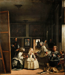
Las Meninas 1665 (Velazquez)
This is interesting because the painter has painted himself in this image, with an emblem that he didn't have-caused a rumpus. It is a portrait commissioned and he was cheeky enough to add himself in!I find it interesting how that light is shining through the door which is far in the background. It is shining on the little girl in the foreground who is the centre of attention, being pampered.
Not everyone is in focus which I guess portrays that they are not as important and that there is movement.
In the composition of the painting there is cropping involved, it make the room seem more intimate as if you were standing there. It makes the image more atmospheric and interesting to look at than if the figures were just standing there in a line.
The Spinners, Fable of Arachne 1655 (Velazquez)
I found this image unusual due to the fact that the people in the foreground are in the dark and the blurred people not in detail are in the background. I guess that this makes sense because the people in the background are the happy, rich people that the workers in the foreground inspire to. They are the workers and it is interesting that you, the viewer, are standing in the same room as them.
Equestrian Portrait Duke of Lerma 1605 (Ruben)
I cropped this because I was drawn to the people battling at the bottom I really liked the way movement is captured. There is block colour, outlines, each person has a character, light, movement, volume and chaos.
The Haywain 1450 (El Bosco)
This portrays the consequences of sinfulness "each man plucks from it what he can". It is very cleverly layed out and when the triptych is closed an old pilgrim walked the road of life, plagued with dangers. I sure as hell don't want to end up in this hell (hanging upside down from a burning building, getting eaten alive by a dog etc). Every scene tells a story, has a narrative, is an illustration of torture...Reina Sofia - Picasso
I find all of these images so visually pleasing. They are so colourful, playful and striking.
Guitar and Mandolin 1924
This is a very shape based image. It is divided into sections of colour, almost like paper cut outs. I really like how the image still has some perspective and shadow (3 dimension), is in a room and you can see out of the window. I also think the tiles and the wall paper are very tasteful. It is interesting how texture is created through pattern as well. I also really like how there are sometimes outlines to the shapes but they aren't always black. I can also get a jolly european sense and can imagine the music being played out of the instruments.
This is a very shape based image. It is divided into sections of colour, almost like paper cut outs. I really like how the image still has some perspective and shadow (3 dimension), is in a room and you can see out of the window. I also think the tiles and the wall paper are very tasteful. It is interesting how texture is created through pattern as well. I also really like how there are sometimes outlines to the shapes but they aren't always black. I can also get a jolly european sense and can imagine the music being played out of the instruments.
The 3 dancers 1925
I love this image. It is strange that it is a lot easier to see as a scan than in real life because the lighting was quite dim and you could hardly tell out the scary ladies face due to the oil. I like the face in the right hand corner coming out of the shadows, I guess that this is the dancers losing their inhibitions? I also like the patterns that are on the scary left ladies body and how they add texture to the shapes. It is very fluid, all 3 dancers are all joined up and although unattractive also very attractive.
I love this image. It is strange that it is a lot easier to see as a scan than in real life because the lighting was quite dim and you could hardly tell out the scary ladies face due to the oil. I like the face in the right hand corner coming out of the shadows, I guess that this is the dancers losing their inhibitions? I also like the patterns that are on the scary left ladies body and how they add texture to the shapes. It is very fluid, all 3 dancers are all joined up and although unattractive also very attractive.
Guernica 1937 (Picasso)
This was the main attraction of the exhibition. It represents a room being torn apart by a bomb, something that they weren't expecting at the time, hence why they were holding things like knives that would do no good. It was really interesting seeing all of his preliminary paintings, figuring out all of the different faces and body language. He explained that he has been haunted by monsters since being a young child and therefore it isn't surprising that he can make such grotesque figures. I think it is quite striking how he kept to a tonal piece. Although everyone/thing is very distorted and out of place you can still distinguish what they are supposed to be/represent and it absolutely captures chaos and trauma accurately.


No comments:
Post a Comment