Monday, 27 March 2017

Study Task 7 Strengths and Weaknesses of me

Practitioner

Strengths
  1. Experimenting and exploring lots of different media when approaching a task to see what I think is suitable and a lot of the time combining multi-media to create an interesting aesthetic.
  2. My developmental stages are a very important part of my design process. It illustrates the exploration of the subject/theme and frequently this journey portrays the intended outcome better than the final piece.
  3. Trying to make sense of my life as a creative person and an illustrator, drawing on experiences/mistakes, trying new things in different directions. I really want to understand myself as a person.
  4. Even though I am not very good at translating my emotions/feelings into words and sentences I have found blogging extremely helpful at finding connections and expressing myself to clear my head from the buzz of excitement and unclear ideas and thoughts. An alternative to this is discussing my work wish other people and their suggestions/opinions/questions spark ideas and give me ammunition to run with.
  5. Get very engrossed into each project, and find it very difficult to get it off my mind. Its like a challenge that my brain is constantly trying to figure out and it won't switch off until I have come to some sort of solution. Perhaps this is because of my dyslexia; how it takes me a long time to process information and I need to break things down into numerous stages.
Weaknesses
  1. Wish that I took better advantage of the workshops provided. Really want to try new things like woodcut and experiment with print making more in the university facilities. 
  2.  I need to get better acquainted with non-analogue means of image making. I need to experiment and explore Illustrator and develop my Photoshop skills (use my Wacom more).
  3. Decision making when it comes to choosing the final product. I'm not very good at deciding on the best elements to combine into a final image. Also I am not good at choosing a final image to submit when there are conflicting views. Is it what I think, what my peers think, what adults think? 
  4. I really struggle to create imagery from imagination, without anything as reference. I don't know why this is but I just don't have a vivid imagination when it comes to fiction, even my dreams are always realistic. I'm not sure if this is because I lack the grips of basic form or not but there is something that stops me from being "silly". Perhaps the reason is because the unknown genuinely terrifies me and so over time I have shut myself off from things which I can't relate to and empathise with. 
  5. It takes me a long time to process tasks and generate ideas quickly. It is also exhausting. I find that any writing task I have to come back to multiple times and can not complete anything in one go as I need processing time to order my thoughts. I also find it difficult completing short tasks, when we have to complete them on the day they are set, because I have to rush into practical work before I have generated and developed my ideas as there isn't time to get space and perspective on them. This is something I realise is important to develop as in the real world I will need to be as fast as possible as often there isn't lots of time to ponder on briefs.
Student

Strengths
  1.  Making sure that everything is completed in time, whether that means pushing myself and cancelling things for a week till everything is completed. To be honest I cant sleep if I know I have lots of things to do as I want to get them done. I always plan how much time I have to do work in between being busy.
  2. I am quite good at getting in the zone in my bedroom. Clear space on my desk and bed, put some upbeat tunes on and have a cup of tea. This is a space where I have the visual language of my bedroom as my surroundings and I don't feel obliged to socialise or get distracted.
  3. Living so close to uni has been a God send. It has allowed me to have a 45 min nap when my ME has played up, lets me save money by having lunch at home and has saved me on the day of a submission when my files didn't save on my Memory Stick but I could run home and back!
  4.   
  5.   
Weaknesses
  1. I am a very busy person with commitments outside of uni work and sometimes I need to priorities things in the short term, like performances, which need time and attention. Things that I had committed to before I know where about in a brief we are.
  2. My health. There always seems to be something which is wrong with me: frequent visits to the doctors or a constant stream of medication.
  3. Sense of place: everything is very disjointed in my brain as a person. This is particularly with memory whether this be places I have been to millions of times or experiences or facts I try to remember. Everything is almost connected but there are important things missing but when I make connections it is a magical moment.
  4.  I am not very good at being alone for too long. After I have broken from my work I find it very difficult amusing myself. I find that I can spend time alone and get focused when I know I have a certain amount of time before seeing someone or doing something. Maybe this is because I put pressure on myself, forcing myself to focus? I have never been able to hang around not doing something productive, even when I watch TV I am drawing or producing something of use.
  5.  

Sunday, 26 March 2017

Royal Academy of Arts

Royal Academy of Arts

America after the Fall (paintings in the 1930s)

Artists at this time were in search for a new visual language that could capture the spirit and struggles of the turbulent times (suffering from: Dust Bowl, Great Depression, Wall Street Crash). A strong contrast to the American Dream and the land of opportunity which followed by the New Deal.

The artists developed their own style, strongly inspired by Paris and its broad experimentation of the period.

Stuart Davis (1892-1964)
He regards his work as ‘an expression of ideas and emotions about the life of the time’ but presented in a modern European visual language. He has a very lyrical “style” and uses intense colour palettes.
He liked capturing the modernity of New York through rhythmical/jazz like paintings. He was strongly influenced by Cubism but created playful images that mixed American Subjects with European visual language.

Skyscraper 
I think this is an interesting collage of different shapes. I like that it uses blocks of colour and that everything isn't quite proportionally correct; it feels fun and quite a lot like an illustration.

Shaw
Communicated through geometric abstraction. He portrayed the sense of being an American through form and colour, representing confidence and progress.

Douglas
Was a key African American figure in the cultural movement ‘The Harlem Renaissance’.
This exhibition held the image Aspirations which is a painting which acknowledges the contributions that African Americans had to national life.
I like the use of different tones in this image in different contours, it really gives me a very spiritual vibe. The use of light is really important in the image and the fact that their bodies are facing away from the viewing, looking into the light with their arms out to create line of sight. It is also clever that in the lower third of the image the arms are up but its quite dark and fits well with the platform they are standing on, making it more interesting. The choice of the colour purple is also interesting because it is a colour that people seem to have reactions to, that it can create an uneasy and powerful atmosphere. This could also be because the use of hot and cold purple is used.


Charles Sheeler (1883-1965)
Sheeler engaged with various subjects but notably the changing face of the city and the new implementation of gleaming machinery in the workplace (but was also interested in the simplicity of early American domestic furniture). His compositions and distilled forms border between representation and abstraction.
In Suspended Power it is evident that this image celebrates the machinery age and harnesses natures energy.
This is an interesting image because I think that the composition is mechanical as well as the subject of the image. There is a line of content directly through the middle of the image and it is balanced out through the circles on the sides. Light is also expertly used on here to make the metal look shiny.

Cinemas became the most popular urban entertainment. In 1936 Marsh created the painting Twenty Cent Movie which captures the aura and the escapism that films offered.

In contrast, In 1939 Edward Hopper created New York Movie which reflects the solitariness of the city nicely summed up by the quote “the stranger is lonely in the midst of a million of his race” by Mark Twain
Edward Hopper (1882-1967)
He created hyper realistic images, going through phases of water colour, oil painting and etches. He was reluctant to participate depicting the “jazzy age” as he had been exposed to the work of realist painters and therefore his work wasn’t highly received. 
This image is like this others:hyper realistic but his urban scenes are embedded with metaphysical undertones which are emphasised through solitary figures. He also used light very dramatically.

Thomas Hart Brenton
He created the painting Cotton Pickers in 1945. I find this a very interesting image because it really communicates; heat, hard-work and suffering…particularly starvation through the use of colour and curves.

Grant Wood (1891-1942)
He grew up in the heart of Iowa on a farm and lived a very insular life at the beginning, before he became aware of the large industrial city 25 miles away and the modern American experience. A lot of these rural experiences really drove/informed the content of his work. He depicts his subjects with vivid realism however his idealistic images were accused of being illustrative in an art world dominated at the time by abstraction. However he stuck true to his visual communication and is renowned for the image American Gothic  which represented a traditional and “idealistic” household of “good”, “faithful” Americans although it was created ironically.

Joe Jones
In his 1933 image American Justice this really represents what I have learnt about the situation of racism, prejudice in America since the War of Independence over slavery. Visually portraying a noose, the Ku Klux Klan, a black lady injured on the floor and a burning house. It is painted in a way that almost makes everything seem unreal and stylised. I guess this is a clever way of showing that this is all inhumane and makes people appreciate how messed up it is by taking it out of the reality.

Phillip Guston created an interesting image compositionally Bombardment in 1937 which is created as a huge circle but the perspective comes from the centre and everything is stretched from the centre to fit the circle.

William Johnson in 1939 created an interesting jazzy and colourful painting Street Life Harlem which depicts positivity in rough times.
This is almost a characature of the people. It looks almost child-like in its loose nature and also unrealistic due to the enlargement and stretching of some features. Also the colours aren't very vivid which helps portray the message they want: of what life is like through hard times.

Revolution- Russian Art 1917-1932

Communist artists were encouraged to make art for every-day life that would reach a wide audience. Mass propaganda was a vital tool of spreading Bolshevik ideology as the population overwhelmingly lived in rural areas and were largely illiterate.
In 1932 Stalin said that Social Realism was the only acceptable style of artwork for the Soviet Union which ended an era of dazzling creativity in desperate times. Red revolutionary banners were commissioned by factories and paraded by workers.

Kliment Redko created the image Insurrection in 1925 which was denounced and hidden till the reform of the Soviet Union in the 1980s. I think this image has a very interesting almost design like layout and is communicating a narrative, story telling. 
This is very strange using geometric shape as a layout. Everything is very regimented and seems like the image is on fire, radiating power and heat due to the outward lines. From a distance the image just looks like shapes however they are actually built up by formations of people, almost like a choreography of a dance in birds-eye view.

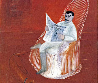
George Publev’s Portrait of Stalin contrasts to many other portraits of Stalin as Publev was experimenting with  a primitive style of painting, in fact he didn’t intend to create such a subversive picture of the dictator. It was hidden away until Publev died.

I like this image. The contrast of red and white is harsh and interesting. I like the illustrative lines and that the marks made are light onto dark rather than the other way around. I also like that it is clear to see that there are things in the background that haven't been covered up very well. Also how the tone of the red differentiates the floor with the wall, without using a distinctive line. 

An important message that needed to be communicated was “shock workers” portraying the synthesis of women/men and the machine, promoting industries and the heroic worker.

Alexander Deineka’s 1972 Textile workers was interesting, portraying woman hard at work. He assembled his compositions from collages of drawings, graphic imagery and photos. His geometric structure portrays and avant-garde visual vocabulary with figurative imagery. 

This image makes me feel quite uncomfortable. The workers seem very unhealthy and and their body language and how they are out of proportion makes them scary. It is not an image that has tried to be beautiful, it is trying to show what is real without any rose tinted glasses. The unblended nature of the figures in the for-ground contrasts strongly with the exact buttons and work in the background. The size of the painting also made the workers a lot bigger than the people viewing which was quite intimidating.


Natan Altan created a collage of paper, enamel and charcoal which combined abstract shapes, graphic letters and texture to represent repressing hard work, dull life without colour diversity or excitement.


The avant-garde passionately embraced revolutionary opportunity to create a new culture.
They took on official cultural roles under NARKOMPROS which recognised their status and gave them secured state commissions which was important as there was an absence in the commercial market. However, talents were constrained by the increasingly repressive state. One of the greatest poets Alexander Blok died in 1921 heartbroken at what the revolution had become-many said that his death symbolised the death of the revolution.

Pavel Filonov  created some unusual abstract pieces  Formulae of Spring 1927
and Heads (Human in the world) 1925 and died of starvation.


Kalimir Malevich developed styles based on pure geometric form and colour and many new artists began trying to produce new brave art. He was a leading painter of Russian avant-garde, a pioneer of geometric abstraction. He invented Supremacism, a purely abstract style epitomised by his “Black Square” which he said represented the “zero” form. Supremacism 1930
In the late 1920s his paintings were denounced by the authorities as he failed to express social realities. His attempt to conform to the Soviet Union dogma that required representation he painted blank faces to hauntingly evoke lost identity on the collective farm. Sportsman 1930
I really like how the figures are made up of shapes/blocks of colour. It is very impacting that they are identifiable as people but they are faceless...there is nothing identifiable about them other than the colours attached, even their body language is the same. This is deliberate to show that there are personalities and talents ingrained in everyone but they were suppressed in this period of history.
Peasants 1930
3 Female Figures


Kuzuma Petror-Vodkin used a curved horizon to portray the past, present and the future in one image (elliptical space). Midday Summer 1917 looking down on his father’s funeral but portraying the circle of life and death. This is a really interesting concept, it is a painting with a narrative...
Fantasy is an image just after Lenin’s death with the rider looking back representing the disheartenment and the feelings that the revolution died with him but that the red horse is riding forwards (the colour of the revolution).

Vladimir Krinsky created a corridor At the Parade 1925  where you walk through the corridor with the walls covered in a crowd (repeated pattern) as part of the revolution as if you are part of it. This is a really clever piece of design using only black and white, blocks of colour, shape bases, simple. It is also used in a really intense way to create business and is very impacting and memorable to walk down.


Sunday, 12 March 2017

Edinburgh

Edinburgh

Scottish National Gallery
I went up to Edinburgh to visit a friend but thought it would be worth my time to go to the National Gallery of Scotland whilst I was there. They were paintings but they still use elements which Illustration. 
 These are paintings by the Scottish John Knox (1778-1845) called 'South Western view and North Western View from Ben Lomond. I thought that these were images of note because they have an interesting use of frame using and arch to focus your attention onto the middle ground which is in the centre of the image and it shows that the artist wants the audience to appreciate the view. It also has a great use of for-ground middle-ground and background, portrayed well through the use of depth of colour (darker in the front and softer and lighter in the background).
 This is 'The interior of St.Bavo's Church, Harlem' in 1648 by Pieter Jansz Saenredam. I think that this is a great example of perspective. It is an extremely difficult thing to paint/draw as the structures are so complicated and need to be perfect to look right. He has really managed to capture scale!
 I really liked this piece of art. It was on a board framed in the centre of one of the rooms with a little plaque saying 'Sir Edward Boncle, Provost of the trinity college kirk'. I thought this was interesting composition with the looseness of the flowing clothing in comparasson to the gold strong angled line. Also the direction of the eyes all looking to the same place, off the painting makes the onlooker feel a bit uncomfortable because they are looking at something which has been cropped out of the image.
 I thought this was nice because it wasn't on a typical canvas and was framed in an unusual way. It is also communicating a narrative through the body language in the image. Everyone is looking in different directions, waving their arms around. Looking at it, you could definitely get a sense of atmosphere and characters.
 I liked that direction of the rope that join everything up through a zig-zag drape which turns the image into something more interesting. I find that the focus of the image isn't so much the people but that this draws my eye from the gold robe of the man, across this zig-zag to the pink dress.

 I saw this painting and fell in love! It is called St Bride and created in 1913 by scottish John Duncan. It is a creation of the celtic revival movement. I think the colours are amazing. Such beautiful strength of colours, varying from the dark sea to the light birds in the sky. I also love the use of pattern and the detail on the clothing and the wings. I love the gold and the way it is used in this image, especially in the hair and how it fits well with the frame and the curves of the border. It is also interesting how the angels go over the border, making full use of the space available. I feel that this is a quite illustrative painting.
 I also really love this image. This is by the Scottish David Gauld of 'St Agnes 1898-90. He is predominantly a stain glass window artist and I think the use of colour and outline here is prevalent. For example his use of block colours with a  different colour to build up tone (would transfer well into vectors). He has included the rowan tree of life and used colours to represent the saints purity. I really love the use of colours and how it is a limited palette. I think it is quite quirky how the painter has used un realistic colours to portray the houses.  The use of lines break up the image horizontally with the contrasting lady in the centre balanced out by the trees.

 These are paintings by Edgar Degas (1834-1917) and one of my favourite painters. His use of blurred, smudgy paint without detail and outline gives the impression of movement and un-focus. It means that when he does use line they illustrate strength and the fact that there arent very many and they are very bold also gives the illusion of movement. It seems like you are watching the performers getting ready from a distance, intruding on their personal space and preparation time as you are looking from a distance and they is a lot of floor. The direction of the arms in the one about makes you follow the colourful dancers arm through the use of their body language. Then the paler one bellow portrays a more sombre mood (perhaps through the use of green) and much sadder body language is portrayed through the dancers looking down.
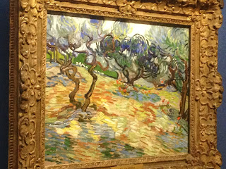
 This is Vincent Van Goghs 'Olive Trees' 1889. This is a very expressive way of painting, building up lots of colours and depth through layers. I found this image particularly compelling because I was trying to capture the strength and windyness of trees in my last project (my book on trees). I maybe should have studied painting as a method of communicating this further as he has really captured what I wanted to portray.


Around Edinburgh
I saw these outside the Accomodation for ex-Scottish Veterans. I saw this as thought it linked well to my the sticker project we are doing at the moment. They communicate something powerful and important through just outline in such a simple way. I also really liked the use of space in these framings that they are not just images within a circle but they the circle is part of the image. 


Whilst walking up Arthurs Seat I noticed that these landscape had such an unusual horizon. It was built up of really unusual building shapes poking out.
On the train I decided that I wanted to draw this. Picking out the for-ground middle-ground and background but wanted the outline to be strong as it was what I found intreguing.

This was the illustration on a coffee on the long journey home.  I think this is quite amusing because it is drawing the horizons of the Edinburgh landscape...there is someone else who found them very interesting. Conversely they drew it loosely as a line drawing and built lots of layers up but I really like it.


I also felt that I needed to portray my experience to get it out of my system. It was a rather cultural experiment visiting my friend and interesting to see what a different university experience Edinburgh Univeristy is to here...
These are quote from a house party I went to...

I also noticed and was pointed out the stereotypical Edinburgh uni student who were EVERYWHERE! I thought that it needed to be recorded and drawing on my character design skills I have developed for the first time drew some characters without photographic reference, purely memory.