Sunday, 28 May 2017

Robin Business Card

Robin Business Card

My band member asked if I could create him a business card. 
I immediately thought something simple like this. I sent him the rough and he liked it.
I didn't know how I was going to make it so I thought that I would try to use my Wacom again as I hadn't used it for a long time. This also was not a direct copy from a photograph and I had to create the image mentally by mashing up different photos of him playing in my brain. I wanted to make it seem hand made (Robin is quite a rough and ready human) but also professional (this is his life and he takes music very seriously) and this seemed to give me a balance.
 I wanted to hand draw the name and make the S the same as the hole in his violin. I thought it frames quite nicely on a slant with his bow and violin and made the image less regimented in quarters as it changed angles. I also wanted to frame the image.
 I thought I could try and add some darker lines onto the clothing to see what that looked like and I found that even those few lines made the image see more sophisticated (is that the right word?)
 At this point I decided that the frame wasn't right. I was really struggling to get a straight line but thought this might be okay because of the aesthetic and maybe I should make the border as thick as the type of his name.
Then I added the information. This was the only font I could find on photoshop and it looked crap. The font was totally wrong and it was really thin.
 I asked my graphic designer flatmate for input and he told me that I should make the border straight. You cant see here but the black doesn't go right up to the border which I like. I also couldn't find how to draw the line straight so I just drew 4 very thin rectangles... He also showed me how to import a different font into photoshop which was more suitable.

Wednesday, 24 May 2017

Chronic Fatigue Syndrome

Chronic Fatigue Syndrome/M.E.

Since uni finished this year I went quite down hill...
I saw the signs coming along in the last module and then I collapsed.
 My friend from home doing Fine Art at Uni of created this as an illustration of the situation. She finds that when she is in a bad way it helps to channel her emotions into a drawing. This kind of inspired me when I was in the pit of sadness.
M.E is one of the silent illnesses that other people can't really see and therefore people can't really empathise with what you are going through and it takes a while choosing who you are going to tell about it.
 I feel that this plays on the metaphor that M.E. in the short term comes in waves. You can feel your legs getting heavy and everything becoming achey, your eyes feeling like they are falling out of you head until you grind to a holt and a big wave engulfs you for a few hours.
 This is portraying how it feels that your arms and legs feel like they are being pulled down by weights and that it is impossible to get up or move because you are being dragged down. It also feels like my eyes are trying to be gauged out .
This is more an image of feeling helpless on the floor with hands trying to drag you down and steal my eyes whilst a big grey ghostly monster is sucking all of the strength and energy out of me.

I feel that these illustrations communicate how I felt when I created them. This is probably the best thing I have drawn from imagination before especially when body language is considered.

I have found that these are quite powerful images and I have shown them to people who are close to me to try and explain how I feel because it is a silent illness. I also have shown a few of my friends who have M.E too and they said they captured how they felt too. My friend and I are thinking about making an anonymous collaborative zine of how we feel with M.E and maybe leaving it at places like the doctors to raise awareness and understanding.

I have been doing more and more drawings of the style about when I am feeling down or hurt and I am finding them really cathartic and a good way of expelling my emotions from my being but not being ignorant to them. They are also a way of showing how I feel when I am affected by someones actions but cannot verbalise/articulate it.

Monday, 22 May 2017

Bean Train Gang

Bean Train Gang

I havn't really created a design logo before but I wanted to take the opportunity of making a band poster for granted. I knew that I wanted to play on the train aspect of the name and so here began experiments.

 I wanted to use the colours scheme of orange because this is the one colour that I have chosen to stand out in the band members.
 I used photocopies of my drawings of the band to experiment with the design. The font here is terrible and on reflection I decided that this was too obvious and a bit ugly, distracting attention from the illustrations. However I did have a concept to explore at this point.
This is where this further development stemmed from. I began to look at motifs that are important to trains and seeing how I could incorporate these more sophisticatedly because we are trying to be professional...


I like this bottom one. I think it is clear enough but also subtly a train. It is also a balances image with some height but also depth. 
I have spoken to a friend and he suggests adding steam on top of the steam perhaps?

Mock up...I wanted to figure out whether to use photoshop to add the font. Problem with this is that I couldn't move the figures around, as I like them with the shadow, so I couldn't get the logo central. Therefore I think I will hand draw the type central and then move the figures around to fit compositionally.


Rick and Morty

Rick and Morty


I watched this for the first time the other day and it was a real eye opener.
The Simpsons have been new to me since starting uni (my first insight into cartoons really).

The whole time I was watching this I couldn't help but appreciate how it was made and the craftsmanship involved.

  • Character design: there are so many different characters in every episode. It made my think back to when I was creating my gifs and the struggles that I had with creating characters but they have so many different characters that are all so different!
  • Layers: Each different scene has so many different layers. It made me imagine the document that they used and how many different layers they had to create for each creature and background
  • Different clips: There must have been sooo many different clips for every single movement! I remember the struggle with creating a very short Gif and have so much respect for the patience involved
  • Expressions: It is crazy how they had so many different expressions and I remember trying to experiment with them in character design and I found it so difficult to achieve.
  • Silhouettes: It is really interesting how they didn't create every character fully and that sometimes they left figures just as silhouettes
  • Tools: I also found myself interested in which tools were used to create the lines... particularly the pupils in the eyes


Sunday, 14 May 2017

Still being developed...

I am in the process of condensing this into an order, prompts in which I am going to present with. These will be a refined list of words which I will practice spieling off.
I am aware that on the submitted script I probably have too much information, especially when I talk about the images I have chosen. I need to practice this presentation over and over and over (because I need to be 100% confident before I perform anything). It is absolutely terrifying but I learn things through writing things down so I will need to keep wiring and editing my scrip before I present.
Really sorry that this will not be documented because it will be evolutionary until the presentation.

Pictures Presentation

ISSUU Presentation Plan

Module Evaluation

Module Evaluation
I have enjoyed researching artists and figuring out Illustration as a whole. It has made me really reflect on who I am as a creative person and analyse the reasons why I am like I am. I have felt that as it has been along-side the more practical modules it has been nice to appreciate other people’s work whilst creating my own. It has also allowed me to post work that I have created outside of the course and made it have a purpose so I don’t feel guilty about taking day trips and doing non uni based work. I feel that the final push is quite a hard project. It is very difficult reflecting on the year as a whole (I find the end of module evaluations difficult enough) and ordering thoughts is very difficult for me.

I have found it really useful having this module throughout the degree. It has inspired me to do work outside of Uni for example filling sketchbooks of places I have been to but also to reflect on things that I have seen further and relate them to my own practice. This is relevant to both galleries and places. Before coming to university I wasn’t really aware of illustration as an individual subject but I am beginning to notice illustration and its usefulness everywhere.
I have learnt that I am still exploring how I create images but that it is becoming more refined due to practice. Through this blog I have been able to document artists which have caught my eye and some of them have inspired my work, for example continuous line and Ruth Allen.
I have learnt that Illustration is a very broad term and can be used for functional images that you see everywhere but also as a piece of craft. I am still unsure of where I fit into the mix, but I am looking forward to seeing what direction I will go through the rest of my degree but I am leaning towards some sort of mixed media collage work.

I enjoyed that this module was not as practical as the others but particularly that it made anything creative relevant to the degree, and it was nice going to see things that were enjoyable but I could also document them and make them relevant to my work.
This was most clearly shown in my visit to Madrid where I left all uni work at home and made a sketchbook just for myself and I feel that I benefited a lot from being inspired and having room to play. This is where I started to really understand playfulness and my continuous line drawings started appearing regularly.
I really found doing the interdisciplinary task very interesting as it began to make me see connections between my dancing, music and illustration and once this process began it’s now impossible to un-see.
I also found the analysing strengths and weaknesses a good task because, although it was difficult to do, I added ideas over time as they came to me and I feel that it is quite thorough and honest. Outlining my strengths and weaknesses really helped me pin point what I need to work on but also what I have achieved this year.

This year I feel that the methods of image making I have developed this year are; Photoshop (learning to use a Wacom and enjoying how the analogue process of drawing translates digitally), continuous line drawings (being a way of sketching and understanding that not every image has to look beautiful), collage (developing mixed media art through paper cut-outs, string and paint), simplicity (trying to create movement through a minimal amount of lines and beginning to loosen up my image making as I want to become less tight and controlling). I feel that I am a very process driven/aesthetic image maker. This is reflective of the images that I like from other artists, like Mark Hearld and Lucy MacLeod, their work doesn’t have a narrative, it portrays the media which they have used as a beautiful or interesting image to look at.

I feel that this Illustrated Self brief might be one of the most stressful briefs I have tackled. Through both projects running along-side each other I can now make sense of my design process and am aware that there is a pattern with each brief. The brief put me in an uncomfortable situation where I had to make a decision part way through my process. I had already identified this as one of my weaknesses and so this proved very emotionally and mentally draining. Reflecting back I am glad that I made this decision as I feel that this piece is very summative of myself. It includes the 4 processes which have been monumental to my image making this year and are things I want to further explore. It also visually represents the creative aspects of my life and captured my character all in one poster.

I have found the Presentation itself very stressful to prepare for. I have enjoyed reflecting on myself and my creative practice but I have really struggled to refine everything and put it into a logical order. Through all of this analysis I have had to reflect deeply on my achievements and problems this year, and have begun to understand what I want to achieve in the future. The whole process of analysis and writing is very confusing for me as I have lots of thoughts buzzing around and feel that everything is connected but I find it hard to articulate. I feel that I would be more confident presenting if it was Questions and Answers. I can happily chat away informally for 10 minutes about things I have made but am going to struggle presenting in a logical order.

I believe this module has really brought to light my strengths, but also things I need to improve upon in the future. I have begun to understand my working process and developed guidelines which I can take forward into future modules. It has also provided me with the realisation that it would be possible to translate my drawings into other medias. For example, translating my continuous line drawings into ceramics, and also working towards doing more print-making, as I’ve really enjoyed using this media in the past. Furthermore, I  need to continue experimenting with simplicity and playfulness. I also have learnt that I need to work hard at Photoshop in order to be confident enough to produce final images on it, hopefully using the Wacom as a bridge between the digital and the analogue that I’m comfortable with.

Friday, 12 May 2017

Presentation

Presentation


This absolutely terrifies me. I am really not very good at articulating what I feel and making it logical. Everything is there buzzing around my brain and everything links and makes sense but it is a feeling rather than words.
I have everything in mind maps and I have explained what I want to say to lots of people, talking it through BUT it gets lost when it has escaped out of my brain.
I am really scared to even begin this presentation. I have started making bullet points and I know what I am doing and how I am going to do it but I am scared that I won't do it justice, that I won't be able to portray what I want to say well enough and miss important things out just because they are implied.
I can quite easily chatter away for 10 mins about my project but its that fact that I have to present it. I think I would find it a lot easier if it was a discussion.
I needed to get the poster out of the way before I could concentrate on this because the stress of that was emotionally draining enough. I don't know if this was procrastination or my awful tactic of being so afraid to start something that it almost becomes physically impossible to begin. This happened a few times through 6th form with scary projects, particularly my German speaking. I physically couldn't prepare for it, even though I enjoy speaking German...
I have left myself 2 full days to create this power point before submission which is a lot of time but I am going to have to factor in a break down which will 100% appear because it is exhausting just focusing on words.

I do have to admit that it was my birthday and I had a performance which took a large chunk out of this week, preparing and arriving early and then celebrating but not too hard.
I also am having trouble with my M.E again... it is making my days a lot shorter than an ordinary day but frustratingly in that I am exhausted and can't get to sleep but I then can't get up in the morning... so my day only is 12.00-22.00 being able to function and do work. I am finding this project very stressful and I honestly don't think I could cope with another project and deadline after this one...

As I was writing this blog my friend was in a bad way and there was nothing I could do to help. I was processing how I was feeling and I then had to deal with this buy writing it all down into a song.
I started off with the lyrics, writing 2 lines at a time then thinking about what I wanted to say. Then once I had all of the lyrics I messed around with some chords until I was happy and then tried to put a melody to the lyrics. This took experimentation and I had to keep developing it until I was happy and could remember the tune. Whilst doing this I had to refine the lyrics so that they would fit to my melody as not all of them did. Then I re-wrote everything down and ran through the song, focusing on expression and the structure and where the chorus's were going to go and how the song was going to end. Then I recorded the song.
This follows the same structure as my process of image making:

  1. Research and processing (understanding my thoughts)
  2. Exploration (figuring out the best way to articulate my feelings)
  3. Aesthetic (figuring out how I want the song to song to sound with the chords and melody)
  4. Refine (making sure the lyrics fit to the tune and getting the structure sorted and practicing it)
  5. Perform (recorded on my phone)


Thursday, 11 May 2017

Creation of final poster

Creation of final poster
I needed to produce something.. to see whether indeed this poster would work or if it was going to be awful and too busy...
I took one section to make as a mock up. Sizing is very important and I realised that to be able to create a poster at a2 that wasn't just my face really scary I needed to figure out how to fit 9 pieces into a2. You can fit 4x a4 pages but 9x almost a5 pages.

When creating these images they look awful until the fine liner is added so I have to take a leap of faith with every image. I don't know why I aquired the little loop around the nose when I was drawing but it just seemed to happen... it looks like I have a nose piercing which was unintentional...
They also didn't look finished like this so I decided to translate the coloured pencil colouring in from my sketchbook to paint. This was necessary because 1) you can see the grain of the coloured pencils 2) they aren't strong enough to be seen in a busy/colourful image 3) i needed to use some media that was opaque so that it wouldn't be a different colour on each of the different coloured backgrounds. 


This mock up proved that the image was in fact to busy even though I didn't want to admit it... the dancers up the sides are just too confusing and make the image look messy... I had to angle the tap dancers for example so that the orange didn't clash with the hair and the green with the trousers and had to leave the centre boarder out because it would directionally look confusing.
what do I do??
It made me feel guilty for wanting to pursue it... that it was a hurdle that I need to cross but I shouldn't be crossing it in the first place...
I started off by blue-tacking them all to a white piece of a2 card.. i learnt from celetaping them in my practice that it would be better to glue them down and it would looks more professional and less flimsy on card. I then realised that the white shows through some of the joins... 
Luckily left over from my Delia Derbyshire I had some green, blue and purple A2 card left... I tried it on the green but the shade was slightly different so went for the blue. It works because it is the darkest colour so not in your face if you see it but it works a lot better because there isn't white on the image.
I also learnt from blue-tacking it all down to start from the top because they don't 100% tightly fit to the A2 page... this means that there is a 3cm blue strip at the bottom (looks better than the top). I am having a debate as to whether I should trim it off (so that the image is very tidy) or whether to submit something to the guidelines of A2 (and leave it on the bottom)...
All of these different images were drawn from life because I only seem to be able to draw from some sort of reference... I composed them so that my favourite ones were in the centre strip and the top left hand corner as I feel that this is where the direction of the eyes go to.
I made sure that when I stuck everything down that the corners were all aligned. Although I had measured all of the rectangles out the same, they didn't all end up being the same size but it was important that the borders had the connecting parts straight or everything would look squewey.
I got very angry at the image... when I stuck the images down they went all wrinkly and that was not OK.. there was nothing I could do though... Once the glue had dried it didn't look so drastic and when everything was compiled together you don't notice the bumps at all.
I then wanted to add string...some sort of texture. I decided that to keep things as simple as possible I should just add the string to one portrait, the centre piece.
I first of all tried it with orangey red paint but decided that to bring the image out of the page it would need to be a lighter colour and that it would still work with yellow but it would make it more prominent.
scans of my favourite portraits

It has been a very stressful process and I made mistakes... this is an example of one portrait that I screwed up and through across the room because I drew the eyes wonky. The other portrait is one I used with a thinner POSCA pen and it created a much more uptight effect and didn't fit with the surrounding portraits well.
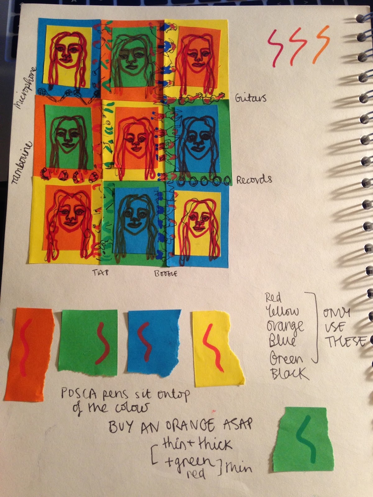
So far I this works. It is in such an order that it doesn't seem confusing. On the diagonal there is the red/orange from the guitars and the tambourines and I am going to diagonal the black microphones with records to create balance to the poster.
I then wanted to try and find an alternative method of incorporating the dancers without it being so confusing. I had the idea of trying to fit them down the side but just as the joins. I thought that this might be less distracting so tried drawing them on white just to figure out where to position them. From this I thought that it would work quite well to keep them on a cut out rather than directly on the different colours. The answer to this was to draw them on yellow (can't be white because I don't include white in my poster BUT yellow is a bright colour and would make the poster seem lighter and less heavy). This called for a 10 minute excitable dance as this was THE ANSWER.

The struggle was then creating images that I was happy with. The scale is really different from my preliminary sketches. I went back to my reference videos and chose my favourite body language positions to draw from. I found the tap dancers extremely difficult and frustrating to draw small proportionally and so I stuck down my discarded attempts.
It turned out that I could pair up the different dancers. For example the 2 from the top images have a diagonal with one arm higher than the other and one leg behind the other.. so I could place these together (showing how my different creative practices all relate).
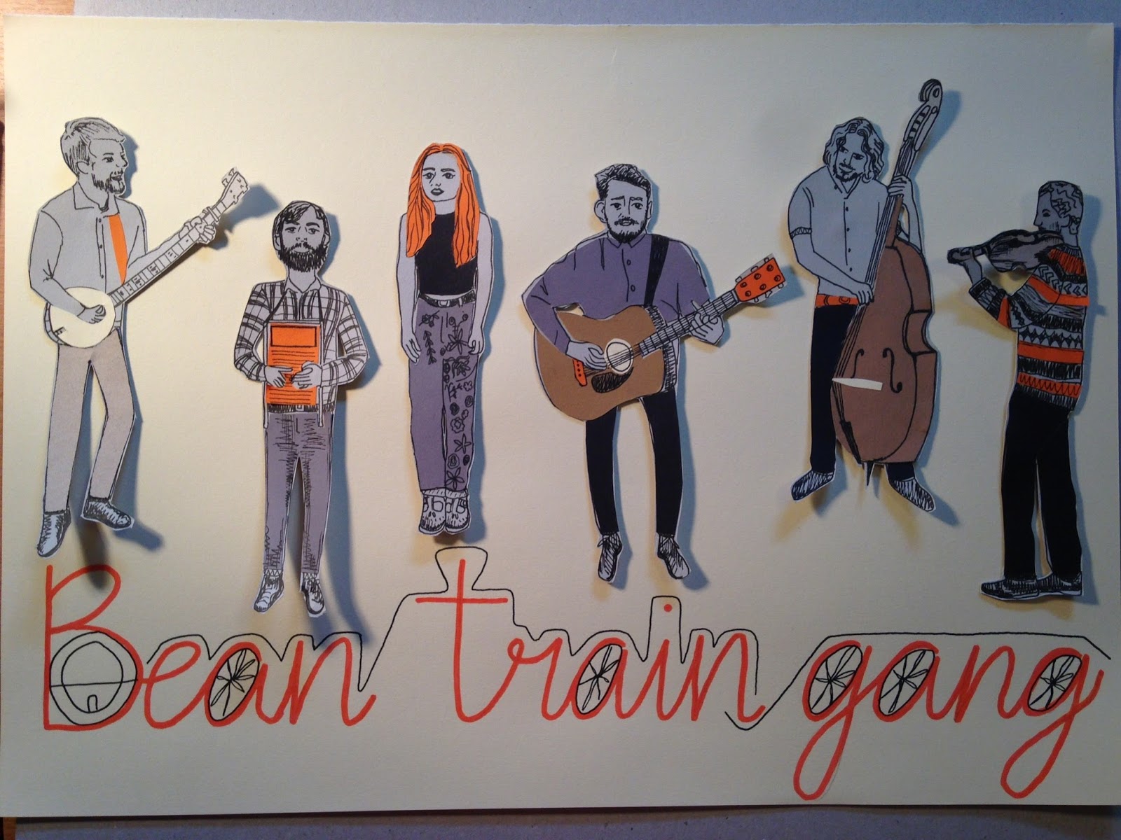
I am really pleased with this final poster. It was a very emotional process but it has achieved everything that I wanted it to and I really like it's aesthetic.

Summary of this project's process:

  1. RESEARCH/PROCESSING: Over whelmed, panic, don't fully understand, don't know how to answer brief, stressed all of the time, taking too long to come up with an idea, starting by asking peoples opinions
  2. EXPLORATION: starting to fill a sketchbook with sketches to do with my personality and hobbies as a starting point
  3. AESTHETIC: coming up with my first idea and getting excited about making it, lots of light bulb moments when combining my sketchbook work to create a final image
  4. STRESS: having to make the decision to continue or not, eating me up, feeling unsure about everything again
  5. REFINE: making a mock up poster, seeing what does and doesn't work before committing to a final
  6. FINAL: creating my final image, having to deal with some hurdles along the way but getting in the zone and finishing the poster
Everybody that has seen this has referred to pop art and especially Andy Warhols Marylin Monroe... I feel that this is necessary to quote because it is true that I have used similar colours and each image is slightly different.

Monday, 8 May 2017

Tutorial

Tutorial

DILEMA
I don't know what to do... I am very excitable over creating this poster. I had gone through my design process of research, exploration and aesthetic and this is a very emotional and stressful process and then it knocked me 6 with the thought of going back to the beginning!
The night before, I created a to do list of everything I was going to complete today and it was achievable within the time and i was buzzing to get cracking on it...
I aprreciate that the design for this poster is very busy. To me it answers the brief. It sums up my illustrated self... 
  • It is colourful like the Delia Derbyshire illustrations I created and beginning to use coloured paper
  • It uses my continuous line drawings that I have begun to use as a tool to draw like most of my sketches towards the end of the year
  • It incorporates looseness and my exploration with simplicity through the tap dancers which where a development from my flamenco dancers
  • It combines digital and analogue. Digital is something new to me at university but I really enjoy using the Wacom and I have developed this in my Context of Practice
  • It also combines my process of finding my favourite parts of a sketchbook (the sketchbook being this year) and combining everything into a collage.
These are the key elements that I feel are really important and resonate with this year. I also feel that this poster captures me as a person and as my friend said "its you on a page". It is very bold and colourful (like my character) but also creates a pattern (which is like all of the clothes that I wear and part of my identity)


I understand that maybe from this mock up it looks confusing and busy... I guess I won't truly know what it will look like until it is created to scale. I also wanted to try out the POSCA pens on the different colours of paper to see how they would react to the different colours.
  • have to get the balance of it being interesting to look at but not scare people off for being too complex
  • This is the proposed alternative. To take one of the 4 elements to portray in a poster. The outcome of this would be very brave and striking. We did this as an exercise for Visual Language (simplifying someone putting on a life jacket) and I remember finding it very stressful and it being one of the only tasks I have ever given up on-I hated it... 

I really appreciate that this would be a very bold way to portray an aspect my illustrated self but I wasn't feeling excited about it and I really struggle to create art if I am not excited about it.

Therefore I was left in a panic... do I do what I am advised to do or do I do what I want to do?
This made me consider "what is success"?
Is success what gets you high grades?
Is success being proud of the final product?
Is success other people liking your work?

Decisions are something that I have noticed to be something I struggle with and that I want to improve. This became apparent at my sticker brief where I made multiple designs and I couldn't chose which one to submit as the final image.
Was it was my tutor liked? was it what I liked? was it the image that fit best? was it the most simple image? was it what my friends liked?-but they all liked different ones!

So this was eating my up, I had to make a decision to begin making something as there isn't much time!
I was very stressed out by this and asked advise of various people that I respect a lot. They cemented that I should do my design because I am so excited about it BUT to make some alterations, to consider how I can simplify it or change it a little bit.

I have also realised that all of my work this year has been aesthetic rather than conceptual. I just feel that if I was to pursue this other idea it isn't summative of my year and I just really want to make this other one!!!