Bean Train Gang
I havn't really created a design logo before but I wanted to take the opportunity of making a band poster for granted. I knew that I wanted to play on the train aspect of the name and so here began experiments.


This is where this further development stemmed from. I began to look at motifs that are important to trains and seeing how I could incorporate these more sophisticatedly because we are trying to be professional...


I like this bottom one. I think it is clear enough but also subtly a train. It is also a balances image with some height but also depth.
I have spoken to a friend and he suggests adding steam on top of the steam perhaps?
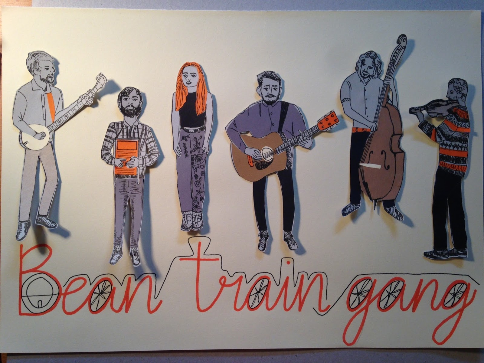
Mock up...I wanted to figure out whether to use photoshop to add the font. Problem with this is that I couldn't move the figures around, as I like them with the shadow, so I couldn't get the logo central. Therefore I think I will hand draw the type central and then move the figures around to fit compositionally.


No comments:
Post a Comment